Tampilkan postingan dengan label 0862 XHouse1. Tampilkan semua postingan

Selasa, 03 November 2009

XHouse Cladding Options

We've completed a drawing sheet showing a range of 3 cladding options for the XHouse series of designs. This will be included in each plan set for the XHouse collection.
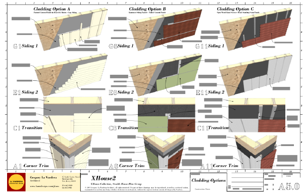


Our Construction Prints have always described a range of siding materials in the Owner's Choice portion of the Material List. The idea here is to show a range of siding options, from simple to more complex which would be specific to the designs. They also range in cost from less to more expensive, but our plans have always been about an open ended design that allowed the home owner to tailor the build to their budget and taste.


The first option is for painted cement siding panels a combination of board & batten and lapped siding patterns. This is the default siding pattern that is shown on our Original Collection designs. The XHouse designs also lend themselves to this cladding option as they typically include two different siding patterns on the walls. This is an accessible option as there is nothing tricky or unfamiliar about the installation, and most contractors will be completely familiar with this.


The second option is for a combination of laminate siding panels and through tinted cement siding panels. In this case the laminate siding panels are shown in a wood grain pattern. There are many siding panels available with this appearance, some with a resin impregnated wood surface, and others with a printed plastic laminate face - think formica for the walls of your house. The installation is shown for 24" high panels with metal flashed horizonal joints. This is not an inexpensive material but is quite handsome. The cement siding in this case is a through tinted material that requires no paint. The installation is a grid of panels with joints backed by metal flashing - no battens. This includes the addition of a drainage layer behind the siding for superior performance.This very siding scheme was featured on the 0751 RS House, and you can see it in those illustrations.


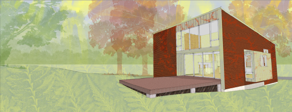
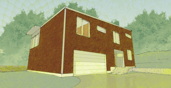
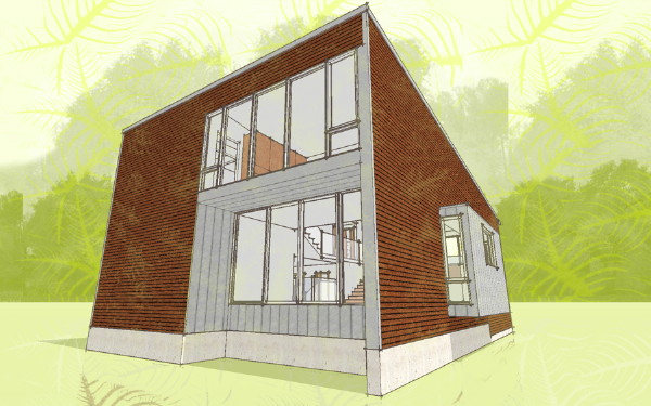
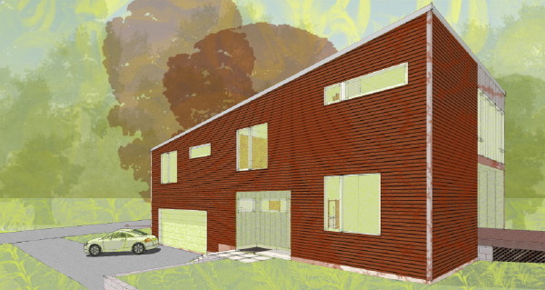
The third option is a combination of open wood rain screen cladding and standing seam metal panels. The rain screen is a recently popular look on many modern houses, and this is in fact the cladding scheme we have been featuring in the illustrations of the Xhouse Series designs. There are a range of woods that can be used for the siding planks, but the key component of this system is the vapor permeable water barrier that provides the final weather barrier for the wall system. The metal cladding is used on smaller portions of the XHouse designs, but is an important part of the overall look of the houses.


Just a little bit more work to complete on the XHouse2 Construction Print set. Look for the official intro before Thanksgiving.

Rabu, 06 Mei 2009

its a wrap - XHouse1 posted to the catalog

After messing with the images for several weeks it was just time to get this show on the road. Design Prints are done and available immediately.


The XHouse1 at lamidesign.com/plans


Senin, 27 April 2009

first take on interior views - XHouse1

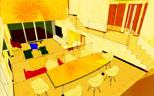
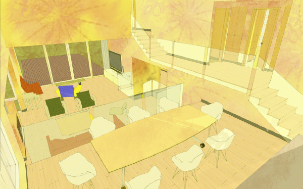
Opinions please: do you like A. the saturated, grainy, high contrast version, or B. with more subdued and even tones but more highly patterned walls surfaces.


Kamis, 23 April 2009

back yard view take 2 - XHouse1

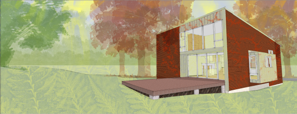
This is the same view posted earlier, but processed. I finally managed to get the leaf texture to show up on the trees, but its made them so light the image has lost contrast. More tweaking to come.


updated, darker overlay at the trees:


Senin, 20 April 2009

Minggu, 05 April 2009

experimenting with new illustration styles - XHouse1

Just as we started with a new look for our illustrations in the Blueprints Collection, we are looking for a new look for the X-House designs. We are trying new software that gives us a new set of tools.


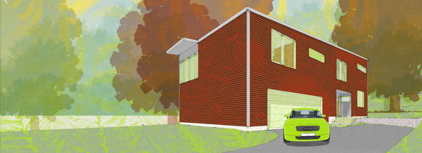
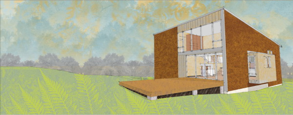
This trial is not radically different than our Original Collection drawings because we've started in the same place. But we are playing with the tools to lay down patterns and atmosphere over the images. This is a first glance at the house with the rain screen cladding.

Minggu, 22 Maret 2009

rain screen cladding - XHouse1

I am beginning to work on the cladding design for the XHouse now, and I've decided to design and detail it for rain screen cladding.


There are two reasons I've decided to go this way. First of all this kind of "slatted" wood cladding has become very popular for modern houses and I must say that I like the look as well. Second, I've seen a lot of this being done in ways that I feel are technically incorrect, with either the wrong membrane behind the cladding, or with closed joints and improper venting of the back space of the cladding system. By incorporating this into the XHouse1 I am going to build a detail set for a good installation that can be reused on future plan sets.


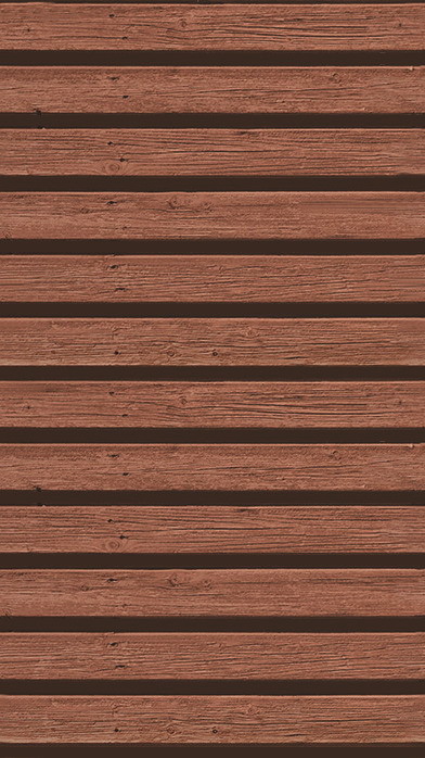
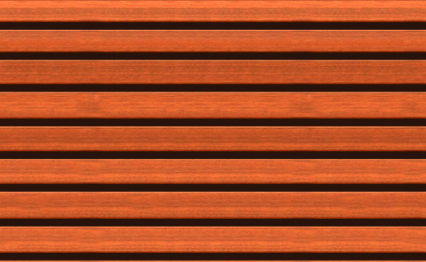
In the meantime I need to dress the model with the proper look for the illustrations in the Design Prints. I'm playing with two textures right now. One with a rough and weathered wood grain, and a second with a very smooth and finished wood.


Senin, 09 Maret 2009

progress image - XHouse1

X House model is coming along, and I'm pondering what to make the illustrations look like for this new collection.


Minggu, 08 Februari 2009

interior almost complete - XHouse1

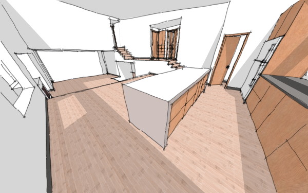
Most of the interior is dressed now, but I've not worked on the extensive interior hand rails yet.


Here's one crazy fish-eye wide angle sketch of the open kitchen, dining, living space from the far corner of the kitchen.


Rabu, 21 Januari 2009

Rabu, 14 Januari 2009

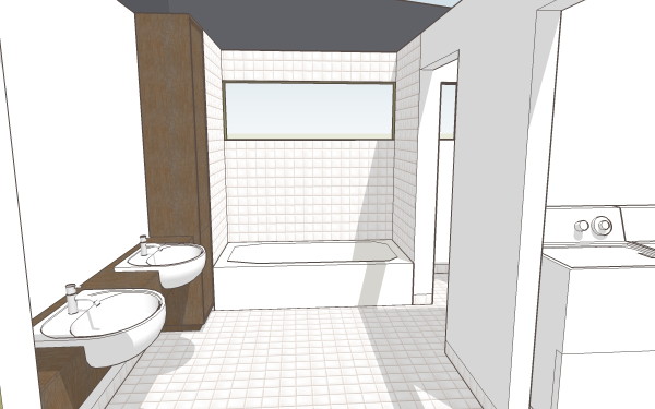
Master Bathroom takes shape - XHouse1

I've begun fleshing out the material textures in the master bathroom suite.


I always enjoy fitting out the bathrooms in a simple and straight forward manner. Customers always seem to build them out in interesting and personal ways no matter how I document them, so I get to fulfill my own bathroom minimalism in the Design Print images.


Kamis, 01 Januari 2009

window fiddling - XHouse1

that's better


I may raise the window sill to float the studio window more in the wall. Its now at 30", desk height, but I may take it up from there.

Rabu, 31 Desember 2008

window locations - XHouse1

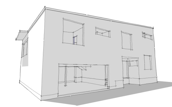
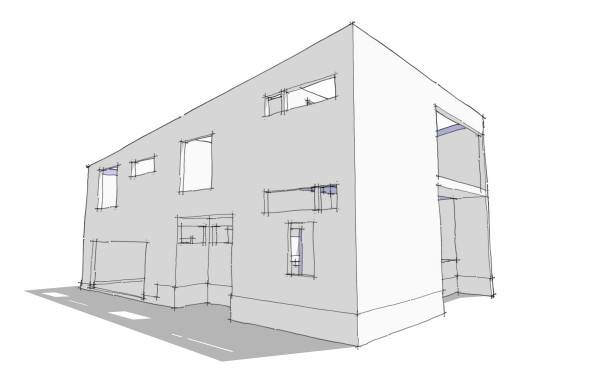
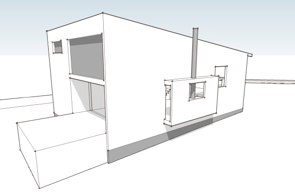
I mentioned this week on the Twitter feed that I was working on the window locations for this new house design. Without an actual site putting pressures on the house from the outside, or an owner's desire for furnishing of the inside to work from the only thing leading the window placement is composition. The windows in question are for the rear corner of the house where the master bathroom resides above the home office/studio space.


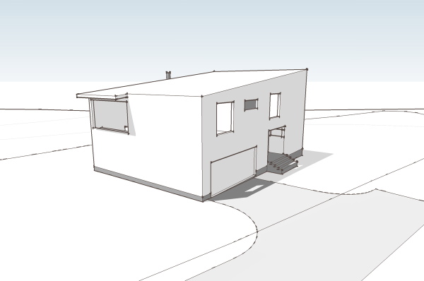
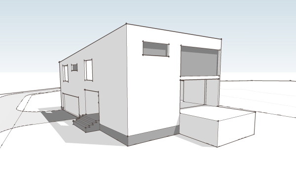
This is an image from the very early sketch model shown on the earliest posting of this design. At this point I had not located any windows for the studio, and had anticipated one high horizontal window in the master bathroom. As the planning of the interior progressed we ended up with the sinks on the rear wall where the high window was shown. I would rather not place a window above the sinks and mirror so that became a strike against this high window. Also I was coming to the conclusion that the massing of the house should reflect the large open space of the living/dining/kitchen that runs front to back, and the more cellular division of the bedrooms, bathrooms and smaller spaces. I think that the two end facades consisting of a contrast of big windows and solid walls worked to reinforce that. But that would mean that the high window in the bathroom worked against this. Strike two for the original bathroom window. Continues after the link below.


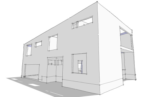
Now this is where it is right now. The master bedroom window wants to be on the side of the house, and it spans over the tub and into the toilet room. Now below in the home office/studio there are two things going on. Number one the space is tall, a story and half because it is under the master bedroom, the highest level of the house. To emphasize the height I really wanted to have a window high on the wall of this room. I also want a window in this room down at eye height, and I want it to conform to the code requirements for a sleeping room so that this can be used as a guest room if desired. In the sketch above I've taken a first shot at placing these windows, the high one corresponding to the master bathroom above and a smaller one below. My problem is that I don't think these are keeping with the DOT-DASH-DOT rhythm of the other windows on this side of the house. The horizontal window at the master bedroom I think is fine, but the two in the studio are making too much "noise".


So there are a few options. I can replace the two windows with a single larger window similar to the two upstairs bedrooms. This will forgo the high window for this space. Or alternatively I can move the high window for the studio around the corner to the back wall to get it off the side facade, but this will violate the solid/void relationship of the end walls that I want to maintain, similar to the earlier sketch. That's what I'm working with right now.

Selasa, 30 Desember 2008

working on new design - XHouse1

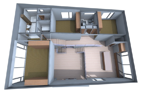
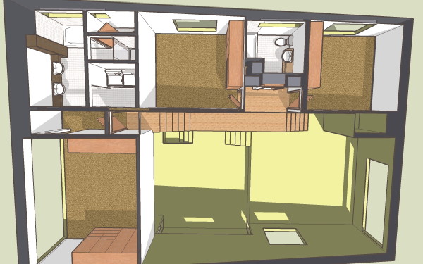
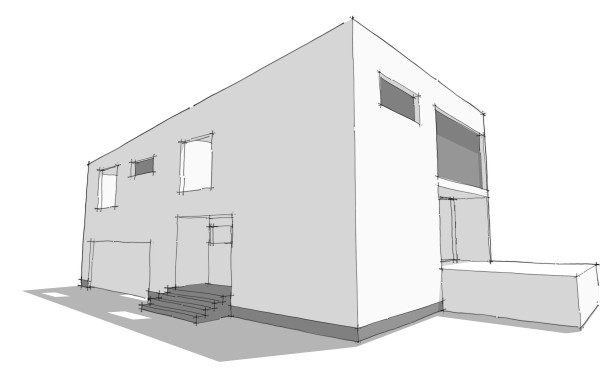
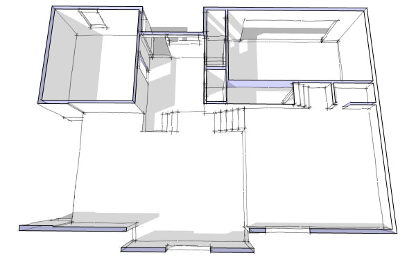
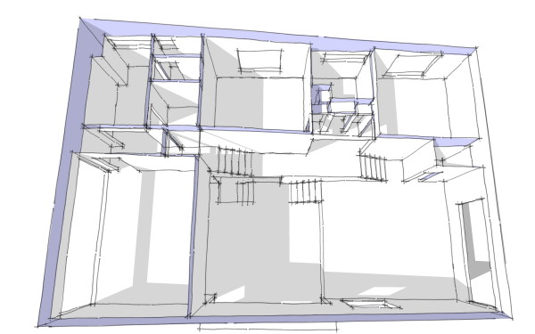
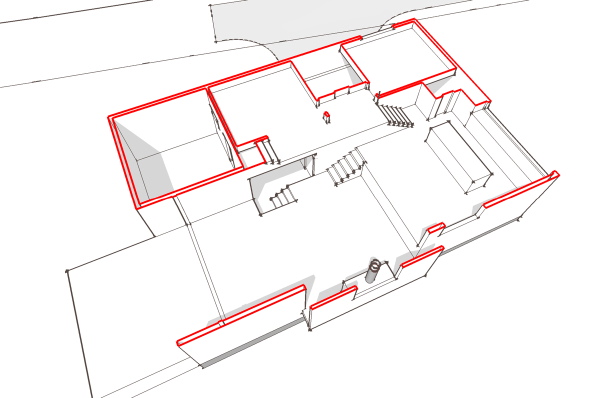
I want to show the arrangement of this house now that I'm working on it a little bit more. It will be the first design in our new XHouse collection, so for now its just XHouse1, until a better naming rationale emerges. I have this feeling that the house is hard to understand from a floor plan, so lets look at the floor plan in a 3d view instead. I think it will be easier to understand how the levels change and the spaces are interconnected.


The entry of the house is the small square space at the center top of this birds eye view sketch. At the right is the garage which holds two cars. The back of the garage tucks under the floor above so the garage looks a bit short in this view. Between the garage and the entry is a passage with a few steps which take you up to the entry. There is also a powder room off the entry here that is also in this space between the entry and garage. To the left of the entry is the home office space. This could also be a guest room, or an art studio. I like this location because for business use you can have visitors and meetings without taking somebody all the way through your house to reach the office.


Proceeding into the house from the entry you come up a short run of steps to the living room. This is a high space that shares the high ceiling with the kitchen and dining area on the level above. A portion of the living room to the left is under a lower ceiling which makes two distinct places within the living room, one more intimate. One can be focused on the fireplace, the other on media. The living room opens to a terrace/deck at the far left. Up another short run of steps is the kitchen and dining area. The kitchen cabinets are not in the model yet, but there will be a work surface the width of the room at the right side, and a large island dividing the work space from the dining area in the middle. There is a walk in pantry at the top right of the kitchen space, and just to the left of that is the steps up to the bedroom level.


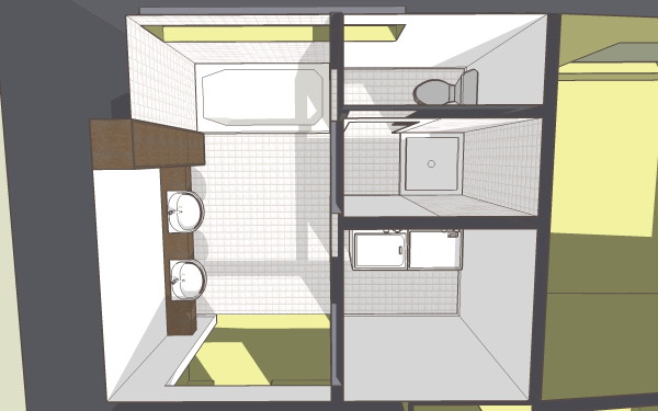
At the bedroom level there is a small alcove with the doors to the two bedrooms and the bathroom. There are a few linen closets here but I've not yet modeled the closets in the bedrooms, but they will indeed have closets. From here there are a few more steps up to the master bedroom level. Upon entering the master bathroom is to the top. It has a large space with two sinks and a tub. Then to left is a small alcove with a shower, and just above the shower is a small toilet room. Below the shower is a laundry room. First design where I've located laundry in the master bath. I've encountered this in my custom work occasionally, but its no by no means the most popular. My thinking was that it could become more closet space if an owner wished the laundry elsewhere. The extra linen storage space at the bathroom could become a stack laundry, or someplace elsewhere in the house found. The master bedroom is to the lower left, and will have closets at either side of the bed.


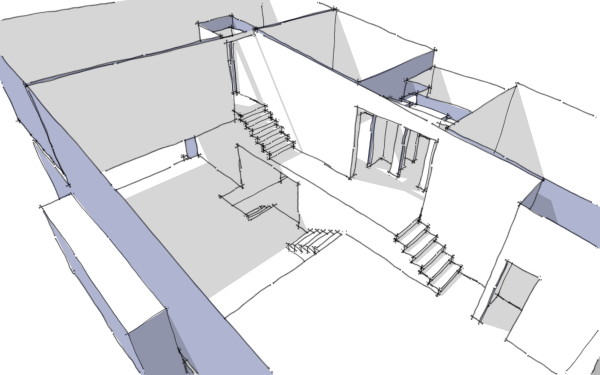
The house is multi leveled and the space really wraps around the central living core. If you deplore stairs you will not enjoy this as going from one room to another involves one or more short stair runs. But if you don't mind steps, and you like interesting spaces then this house will please. Its at once intimate and circuitous. Each room feels far away, yet is close by.

Rabu, 12 November 2008

Fleshing out a new design

This is one of the designs that originated from the design phase of the suburban house project.


I have to confess that I find the space really interesting, but no doubt it won't be for everybody.

Technorati Tags: , ,

Senin, 19 Mei 2008

0751 Suburban House - fourth scheme

Today we will look at the next scheme from the suburban house project. This scheme came later in the process and so the sketches are more fully developed than the other schemes we have looked at. In this scheme we returned to the idea of the gathering of spaces around the living room, with the secondary spaces seeking a physical connection back to the center of the house. We also struggled to find a way to make a positive solution to the need to elevate the plumbing in the house above the septic system without lifting the entire house out of the ground and compromising the connection to the landscape or bringing in large amounts of fill. What we arrived at was a rather complex interior space arrangement which followed a multi level path through the house, but existed within a simple massing under a simple roof.


I think the house is difficult to understand from floor plans, yet we'll look at them anyway. Those of you who can read plans well will enjoy the jump from flat-land to seeing the space in your mind. For everybody else we'll look at some better representation further down.

click below to continue reading..


So on the ground floor you arrive at the house at what is a very ordinary suburban situation - a garage door flanked by a recessed entry. This gives way to a small vestibule which is also joined by the entry from the garage. Adjacent to the entry is a nice sized home office/studio space. This is great for home office workers as it is removed from the rest of the house and is even workable for taking meetings without parading through the home. From the entry you proceed up a third of a level to the living room - a small stair.


You arrive in the living room space, a high story and a half space. Straight ahead is a fireplace with niche on either side (actually not drawn on plan), to the left is the kitchen and dining area, which is another level up, and to your right is a more intimate area with a lower ceiling that has a window wall facing out to the site. Take the short steps up to the kitchen and you have a large table area that overlooks the living room. The kitchen has a large island, and another counter at the wall. Above the countertop is a large window looking out at the front of the house. At one side is a pantry space and another short stair that brings you up to the bedroom level.


The bedroom level has short hall/balcony that overlooks the living room. The two bedrooms share a bath room and have windows overlooking the side of the house where the entry door is located. At the end of the hall is yet another small stair that takes us up to the master bedroom level. The master bedroom bridges back over the living room on the left, and to the right has a large area for closets and master bathroom. Unlike the other bedrooms it is very isolated and feels removed from the rest of the house.


This section view above gives you a pretty good idea of all these level changes, but this cut away view is probably even better for understanding the layering.


And here is a rough walk through of the sketch model which will give you the best representation of the space and how the parts relate to one another.


I liked this solution as its simple geometry was efficient and economical yet it provided a very dynamic interior space that served the program. Right now its my favorite candidate for conversion into a stock plan.


Technorati Tags: , ,