Rabu, 28 Mei 2008

Notes from the Glass House – yours and theirs


The Glass House sketchbook features quotes by Philip Johnson, blank pages for your own notes or sketching, and sketches inspired by the site by 29 architects, designers, and artists including: Yves Béhar, Michael Bell, Deborah Berke, James Biber, Mattia Bonetti, Constantin Boym, Seymour Chwast, Stephen Doyle, Steven Ehrlich, Rafael Esquer, Alexander Gorlin, Steven Holl, Christopher Huan, Rainer Judd, Maira Kalman, Chip Kidd, LOT-EK | Giuseppe Lignano and Ada Tolla, Mark McInturff, Richard Meier, Toshiko Mori, Michael Morris, Fred Noyes, Gaetano Pesce, Ron Radziner, Jens Risom, Yoshiko Sato, Denyse Schmidt, Alison Spear and Joseph Tanney.

All proceeds from this sketchbook will support the Glass House.

The custom edition Glass House Moleskine® sketchbook costs $25.95 can be purchased at the Glass House gift shop, or by calling 203.594.9884 - x 1. – GF
Selasa, 27 Mei 2008

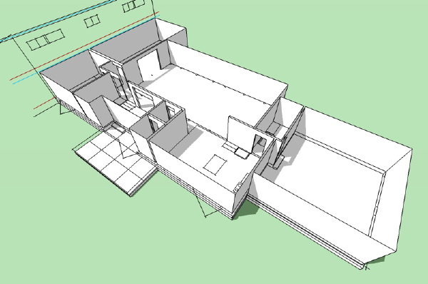
0857 L House - model takes shape

Building, building, building...


Technorati Tags: , , ,

Alice Ball

If you're interested in the fate of Philip Johnson's Alice Ball house, in New Canaan, you no doubt have already seen the Times story from Sunday and the post in Mediabistro.com (which linked to us; the Times, of course, did not, although the Times reporter spent a lot of time clicking around on our blog about two weeks ago while preparing the story).

The Times story is a rehash, although it does manage to get one important fact wrong: it cites as an example of modern houses commanding steep prices the sale of Neutra's Kaufmann house not long ago. But I read in the Times the other day that the sale did not go through; the anonymous buyer has either backed out or couldn't come up with the money or something, it wasn't clear (in fairness to the Times reporter, the Alice Ball house story was in a section that goes to press earlier in the week, and the news about the Kaufmann house sale might have come out afterwards).

Mediabistro.com isn't quite as kind to Cristina Ross, the owner of the house, as we have been, and I find the snarky style of the writing to be off-putting, but here's the post (which, by the way, uses our photo, which is fine -- we put it on Flickr and we ourselves rarely feel any compunction against using other people's photos). -- ta

Rabu, 21 Mei 2008

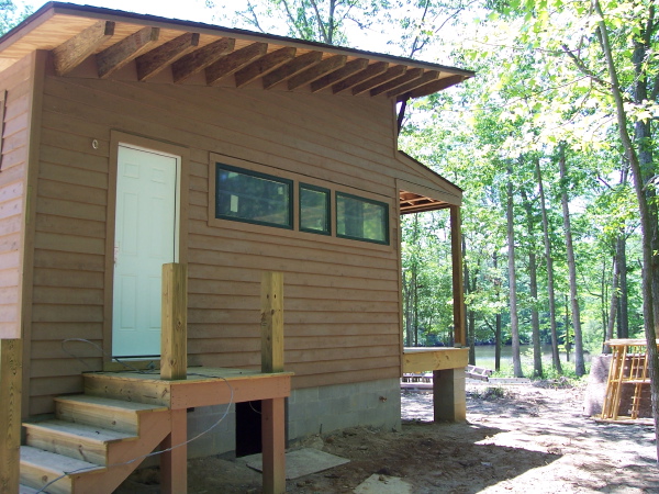
Virgina Plat House - exterior complete

A few new photos from the owner of the Virginia Plat House today. The siding is all done and the exterior more or less finished. The interior work is beginning now.


Here is the master bedroom side of the house. I liked this photo because it gives you a good look at the side overhang rafters. They did a good job with this detail which is always gratifying to see. You can also catch a glimpse of the creek in the distance - what a great setting for this house.

There are three new photos of the house posted at the flickr set for this project. Also remember to look at the LamiDesign Flickr photo pool to see all the photos from customers documenting the house designs under construction. Our thanks go out to them for sharing their projects with us.

Technorati Tags: , , ,

Senin, 19 Mei 2008

0751 Suburban House - fourth scheme

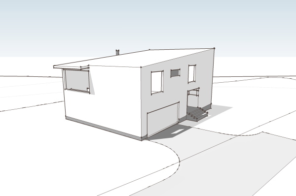
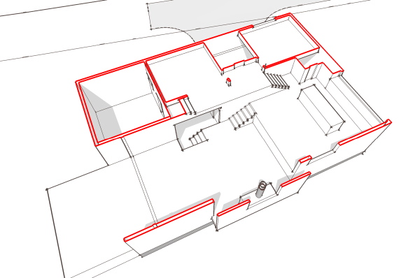
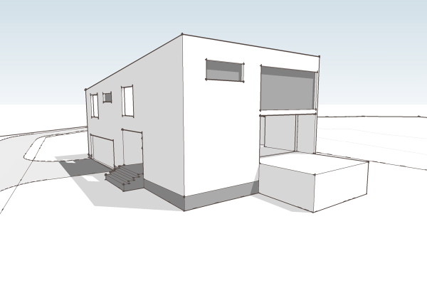
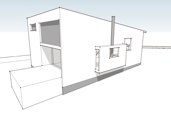
Today we will look at the next scheme from the suburban house project. This scheme came later in the process and so the sketches are more fully developed than the other schemes we have looked at. In this scheme we returned to the idea of the gathering of spaces around the living room, with the secondary spaces seeking a physical connection back to the center of the house. We also struggled to find a way to make a positive solution to the need to elevate the plumbing in the house above the septic system without lifting the entire house out of the ground and compromising the connection to the landscape or bringing in large amounts of fill. What we arrived at was a rather complex interior space arrangement which followed a multi level path through the house, but existed within a simple massing under a simple roof.


I think the house is difficult to understand from floor plans, yet we'll look at them anyway. Those of you who can read plans well will enjoy the jump from flat-land to seeing the space in your mind. For everybody else we'll look at some better representation further down.

click below to continue reading..


So on the ground floor you arrive at the house at what is a very ordinary suburban situation - a garage door flanked by a recessed entry. This gives way to a small vestibule which is also joined by the entry from the garage. Adjacent to the entry is a nice sized home office/studio space. This is great for home office workers as it is removed from the rest of the house and is even workable for taking meetings without parading through the home. From the entry you proceed up a third of a level to the living room - a small stair.


You arrive in the living room space, a high story and a half space. Straight ahead is a fireplace with niche on either side (actually not drawn on plan), to the left is the kitchen and dining area, which is another level up, and to your right is a more intimate area with a lower ceiling that has a window wall facing out to the site. Take the short steps up to the kitchen and you have a large table area that overlooks the living room. The kitchen has a large island, and another counter at the wall. Above the countertop is a large window looking out at the front of the house. At one side is a pantry space and another short stair that brings you up to the bedroom level.


The bedroom level has short hall/balcony that overlooks the living room. The two bedrooms share a bath room and have windows overlooking the side of the house where the entry door is located. At the end of the hall is yet another small stair that takes us up to the master bedroom level. The master bedroom bridges back over the living room on the left, and to the right has a large area for closets and master bathroom. Unlike the other bedrooms it is very isolated and feels removed from the rest of the house.


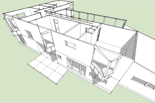
This section view above gives you a pretty good idea of all these level changes, but this cut away view is probably even better for understanding the layering.


And here is a rough walk through of the sketch model which will give you the best representation of the space and how the parts relate to one another.


I liked this solution as its simple geometry was efficient and economical yet it provided a very dynamic interior space that served the program. Right now its my favorite candidate for conversion into a stock plan.


Technorati Tags: , ,