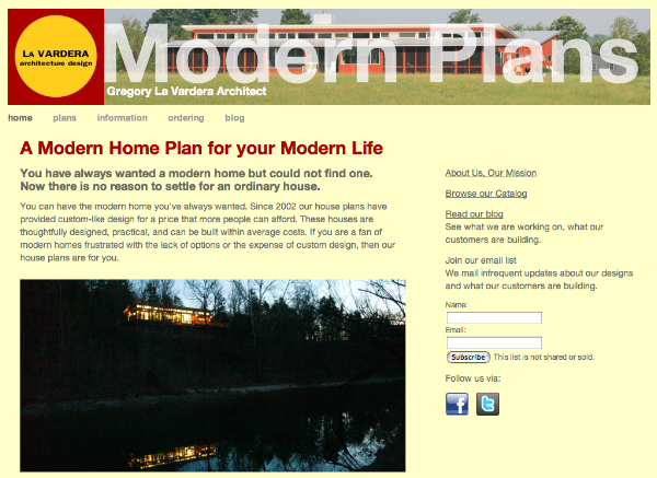
Readers of the blog may have notice a new look for the header here. Its all part of a total redesign of our Modern House Plan catalog.
Yes, its been long coming. Believe it or not our House Plan Catalog is nearly 8 years old. That's getting long in the tooth for a web site, the likes of which seem to churn a new look every few years. The truth is we've just been too busy to attend to this, and in the face of newer web sites vying for your attention it had gotten a little stodgy looking around here.
The new site maintains the structure of the old site. What that means is if you had bookmarked your favorite house, then your bookmark will still work - takes you right to the current page for that house design. We have A LOT of incoming links into our catalog, and until we can fund a more comprehensive re-invention of the website with the sophistication to maintain those current links, we elected to work within the structure already established.
So what's new? Well, at this point we pretty much know what information is important, and what we had that was fill. So we've trimmed the content somewhat, and moved you closer to the house plans. Now when you land at the site you immediately see our customers houses. A click into the Plans page gives you immediate access to all the designs, as well as links you into the useful lists of groups and collections. Once in the catalog you'll find bigger drawings of all the designs, and a nice slide show interface for viewing the images.
And perhaps most important is now we can tell our story about how we and our customers got here. Before the message was "Hey, this is new - you can do this!". But now customers have built over a dozen houses, and we don't have to convince you that this is for real. Now the story is "Hey, we've been doing this, a lot, and now so can you!"
So get over there and take in the new look.

Tidak ada komentar:
Posting Komentar