Rabu, 31 Maret 2010
Villa Vals, the house in the hillside
On the website and in the PDF brochure there there are more photos of the inside which I'd not seen previously.
– GF
Selasa, 30 Maret 2010
XHouse3 Construction Prints officially in production
Contest fun is all over now, so its back to production work to get all the great designs we have in Design Prints available in Construction Prints.
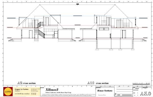
Next up is the XHouse3 design. Three bedrooms, a home office, 1,986 sqft, MoTrad modern traditional fusion design. Order now, and we'll push it out the door for you faster than you can say anti-mcmansion 5 times. Above, house section sheet from the Construction Prints underway. Yes, thats right, if I'm up to the sections that means the plans and elevation sheets are already laid out waiting for notes. Its closer than you think.
Minggu, 28 Maret 2010
Usonia House: A Few Photos

Stephie Podell,who grew up in the Usonia house, in Mount Pleasant, New York, that was destroyed in a fire a few weeks ago, was nice enough to share a few photos with us. Here they are.


Jumat, 26 Maret 2010
A little break from Modern architecture . . .

Love Letter is a project by tag artist Stephen Powers with the City of Philadelphia Mural Arts Program. The messages – created as an homage to 'Cornbread' the Philadelphia graffiti artist whose messages to his girlfriend adorned many buildings in the late '60s – are in the West Philadelphia area, best seen from the Market-Frankford Elevated train line.
When completed, the project will encompass 50 painted walls between 63rd and 45th street on Market Street, a documentary film with scripted elements, a sign school and shop that will provide training for area youth and free signage for businesses on the market street corridor, and 2 books documenting the project. One of the books will be a small paperback that will be distributed to area businesses free of charge, for them to sell to visitors. The other book will be a larger hardcover book that will document not only the artwork, but the neighborhood and the inspirations of the Love Letter Project. –GF
Kamis, 25 Maret 2010
The contest is over, the Lagom House is just beginning
Well we are sorry to report that the Lagom House did not make the cut for the 12 finalists in the design contest. However we are very happy to note that the Lagom House did finish in the top 30 and earned an Honorable Mention from the judges.
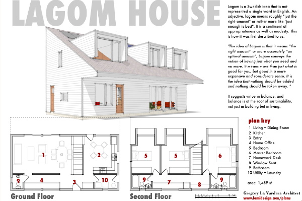
All in all we are thrilled with the results, and must confess we are glad we did not have to spend another two weeks begging for public votes! Another disappointment however was that none of the designs I highlighted during the voting made the final 12, and only one other made it into the top 30 with the Lagom House. That design would be the Simple House design by Bob Swinburne. Correction: the Transition House by Studio Interpretation Design also made it into the top 30, so including Lagom House 3 of my picks made honorable mentions.
I enjoyed preparing the Lagom House design for the contest, and reaching out to all of my followers and friends through many mediums was a great experience. If FreeGreen organizes another contest we will certainly participate again. However I don't think we will enter with quite the same determination to win as we did this time around. In my correspondence with other entrants and supporters watching from the side there was a palpable frustration with the voting. Designs that seemed contrary to the spirit of the brief collected many times more votes than better designed houses, and other designs that were extravagantly detailed or represented with what would be prohibitively expensive materials seduced a public that voted for what simply looked best. Yet sensible, well designed proposals languished at the bottom of the listing unseen by visitors that began at the top.
In the end the voting was like a microcosm of the real housing market! Popular choice driven by gratifying image is not a formula for discovering the best of design. Honestly I'm surprised the Lagom House with its stark facade placed as well as it did. To that I have to credit the faithful supporters of our house plans that turned out to vote and kept us near the top of the pile. The value of the contest and the reason we will participate again was in the exposition of so many ideas, and the exposure of our work to so many people.
We took a stand with the Lagom House - to design a house smaller than requested in the contest brief, and to adhere to a minimalist aesthetic that lent itself to affordable construction from common construction materials. It was a lesson in doing more with less, making a great floor plan that shaved hundreds of square feet from the program, and making a strong design statement that by that fact turned off some viewers. The Lagom House is a real solution, something that can be built tomorrow. Its proof that practical affordable houses can also be energy efficient as well as a strong and even polarizing piece of architecture. Its proof that housing could be so much better than it has been in the recent past. Its the way we should build moving forward. No, we did not win, but consider the high placing of the Lagom House a cannon shot across the bow of the status quo.
Usonia Fire: "This Was My House -- My Childhood Home"
This was my house - my childhood home - The Jerry and Charlotte Podell house built in 1959. The loss we feel is unimaginable. My father is no longer alive and obviously, though we miss him each and every day, we are thankful he is not alive to have witnessed this. We haven't told my mom as yet - not sure we will.
So sad.
She also points to the Greenhaus blog, from Modernism magazine, where Stuart Basseches writes about what it was like to grow up near there (and posts some terrific photos too).
Stephanie, we would love to put some of your photos on our blog, as a way to show people of what a beautiful house it must have been. -- ta
Andy Goldsworthy might feel right at home here


I've seen photos of this house before, and immediately each time, the work of environmental sculptor Andy Goldworthy springs to mind.
Designed by the Architectural office Zecc in Utrecht, the Netherlands, this house has an exterior I want to feel. And stand next to on an early Spring day when it radiates the sun's heat back out. And smell the mineraliness of when it just begins to dampen in the rain.
Zecc says its designs are Clear and Sparkling (with those capitals), and explaining the name of their business, they say "Zecc is not an abbreviation, but it is a name. Zecc is inspired by the French word Sec: pure, simple, clear. Sec as a strong foundation, touched up with an extra ‘c’ and a spark of sensuality as expressed by the Z. Zecc equals clear & sparkling . . . SENSE would be a synonym for Zecc. We create sensible architecture with a sensual quality."
It's nice they've thought a lot about their philosophy (there's more explanation on their website about Grounded Architecture and other guiding principles), but I'm just interested it touching this house!
If you go to Zecc's website, check out the "Re-Use Cultural Heritage" tab under Projects. I always like to see how purpose built or industrial buildings are reborn as living spaces, and I love the hanging staircase in the Schoolloft renovation. – GF
Jumat, 19 Maret 2010
Philip Johnson's First House is on the Market, in Bedford, New York

The first house designed by Philip Johnson for a client just came on the market, for $2 million, in Bedford, New York, the next town over from us. Built in 1946, it's called the Booth house but most recently it was the longtime home of Robert and Sirkka Damora.
Mr. Damora, an architectural photographer of note (Walter Gropius said of him, "I consider him the best the best photographer of architecture in this country") passed away at age 97 a year ago, and his family is selling the house.
Here's a description of it:
Unlike the Glass House, where Johnson shaped the landscape with carefully created vistas, the Booth House was set within an existing topography. Sited on the graded crest of a wooded slope, it takes full advantage of the towering trees that enclose the house. Nature enters into the house as an almost physical presence. While the Glass House has a temple-like quality, the Booth House strives to be only a comforting shelter for daily family life—a fact valued by the late architect and pioneering architectural photographer Robert Damora and his widow, architect Sirkka Damora, who acquired the house in 1955 and lived there appreciatively for 55 years.
The 36 acres next to the house are permanently protected as a nature preserve by Westchester Land Trust, my employer, and in fact on my first visit to the preserve, in 1997, I met Mr. Damora and chatted with him for a couple of minutes, and I remember thinking that he was someone Gina and I should visit. We never did, but last June we were invited to have lunch there with Mrs. Damora and the Damoras' daughter and son, Jesa and Matthew. It was a surprisingly cool, rainy day but the house was warm, and it gave me that sense that modern houses often do of being part of the outside world even when I'm inside and comfortable.
Here's the website with the real estate listing. There's a lot of good information and photos. And here's a website the Damoras' created to showcase Robert Damora's photographs (the photo above is by Robert Gregson). It's well worth looking at.
I should note by the way that the Booth/Damora house is listed for about $850,000 less than the much smaller, right-next-to-the-road Alice Ball House that Johnson designed about a decade later. - ta
Kamis, 18 Maret 2010
On the calendar: Victor Civkin – Westport Modernist
Rabu, 17 Maret 2010
Usonia Fire: A Few More Bits of Information
There's credible information about Usonia and the house that burned in the comments to the previous post. Thanks for keeping us informed!
Selasa, 16 Maret 2010
The Usonia Fire: An Update
Not that it makes the fire any less of a tragedy for the family that lost its home, or even for architecture aficionados, but the house that burned down seems to be one of the many designed by a Wright disciple rather than by Wright himself.
There were 47 houses built in Usonia, three designed by Wright and the others designed by other architects (here's what Wikipedia says). Wright also designed the layout of the community, which was conceived after World War II by a group of friends who believed in the principles of modernism espoused by Wright.
In the years since it has matured into a quiet, discreet, wooded neighborhood of houses whose value has risen significantly and which beautifully retains its original Wrightian (if I can use that word) qualities. I've never been in one of the Usonia houses and I haven't driven through the neighborhood in years, so I can't say I know it well at all. But my sense is that it has managed to retain its integrity without turning into a museum. It's a living neighborhood. I feel bad for the people who lost their house.
If you Google "Usonia + Pleasantville" and then click "images," you can see what some of the Usonia houses look like - ta
Senin, 15 Maret 2010
Wright House in Westchester Burns to the Ground
Here's a map of the neighborhood.
Sabtu, 13 Maret 2010
Tipsy much?
 I wish I had a space big and bare enough for these book cases. They wouldn't do as well in a tight space, as the airspace around them is necessary to define their design. Created by Dzmitry Samal. Seen on Design Milk. – GF
Sabtu, 06 Maret 2010
Contest entries to vote for - our recommendations
In our last installment of our House Design Contest blog entries we described what we thought were the important characteristics of a good house plan product. Lets look at some of the entries that live up to this. I believe they are significant because they roll together the best aspects of creating a product and creating good architecture at once.
Of course our first choice is our own design entry, the Lagom House.
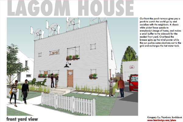
The Lagom house is pushing the boundary in size, coming in several hundred square feet less than most other 3 bedroom homes in the contest. Obviously this will limit its appeal for some, but also extend its reach to many who can not afford to build an extra 300 sqft. Please vote for the Lagom House here.
See the rest of our choices after the link below.
Moving on to my favorites I would like to have you look at the Duval design by Content Design Group. This understated design is successful on many levels.

Here is a modern house that fits well in existing traditional neighborhoods as well as sets out a pattern for developing new neighborhoods of similar scaled and priced homes. In fact this would be an ideal neighbor to the Lagom House. The Duval makes good use of the site by creating a central outdoor space, a courtyard enjoyed from the main living space in the center of the house. The rear of the property is reserved for work - parking from an alley, gardens, and yard work tools. Have a look at it, and vote for it here.
Next take a look at the design by freelancer Tim Brennan. He has created a small 1136 sqft home, one of the few designs in the contest smaller than the Lagom House. Two bedrooms with a garage within the footprint, his subRural House design has a scandinavian austerity to it that really appeals to me.

I like this design, I like its restaint, and I like the way he has represented it in a range of situations. This house design is a good house plan product, and a size that is sorely lacking in the market. Give it a vote here.
Next I'd like you to take a look at the equilibrium house by the same named design office in the UK. In some ways this house breaks some of my rules. The dense placement of freestanding homes is a pattern once common in our cities, has largely fell out of use. More common in the US are attached "townhouses", or detached homes with wider spacing. But the pattern suggested by the equilibrium is so nice its well worth my endorsement.

The staggered footprint of the house makes great use of the site. It allows for shallow lots, and therefore narrow blocks, yet wide frontage and rear gardens that is great for integrating the driveway and cars. The floor plan is smart, and even though a UK design they seem to have pegged US expectations. I think more study of US house industry could yield more feasible cladding and construction. But I'm cutting slack here because I so like the overall design. Check it out and vote for hit here.
Next I invite you to take a look at Rober Swinburne's Simple House. Sinburne is from Vermont and his design takes into account many of the issues faced by homes located in colder climates, and as a result energy conservation is definitely on the plate here.

The Simple House is a good blend of modern and traditional sensibilities, such that a home buyer looking for a traditional house, or a home buyer looking for a modern house would probably both be satisfied by this design. I think that says a lot for the reach and appeal this design could have - I think it would be a very successful product. Construction is very conventional, and any builder could make this house without a blink. None of the edginess and design in your face of many of the other entries, but I can guarantee you that this design would outsell the other swoopy ones by a long shot. A contest winner? Maybe not, but a product winner, yes. Vote for it here.
Next have a look at the Transition House by Studio Interpretation Design. This is a house I could see existing comfortably in many US neighborhoods of homes of similar size. Its modern, it fits in a traditional neighborhood, and basically has its cake and eats it too.

It has a really nice, smart, rational floor plan, well configured for a narrow deep lot. The house would fit perfectly on a street of other homes oriented in a similar way - narrow and deep. This house could have easily been articulated with overt gestures, green lattice on the walls, wishful edgy technology, and other bells and whistles to win green points. Instead the design shows great restraint. It telegraphs the designer's understanding of what might really get built and widely adopted. This is a house that an average Jane and Joe could afford, and an average builder would have no problem building. Support it with a vote here.
Next is the Passive Solar House by Jason Roan. This was designed for the retirement house profile, so its only two bedrooms within its 1800 sqft. But its a simple and well laid out design.

Clearly something any average home builder can execute and do a fine job with. View it here, and vote.
Next have a look at the O-House by Modaby Design. This house has an interesting modular layout that allows the house to be reorganized to take advantage of sun exposure on different lots. Very clever.

The design does include a number of diagonal wall surfaces that could drive the cost up, but it would also turn out just fine if these were simplified by the owner and builder to meet a budget. The design of the house can stand up to that kind of tinkering. See it here, vote for it.
The next entry you should look at is Windswept by David Cox. This house has a great plan layout, with a car port that doubles as a shaded outdoor living space. The home office is also divided from the home which is a great feature if you find a home office distracting.

The scale of the house is realistic, and it just feels like something that can really be built. Vote for it here.
Next is the Nock House by Red Dirt Design. At a glance it appears too big for a starter house, but when you look at the plan it is composed of discrete part that could allow the house to be built in phases. The core of the house with living and bedroom spaces is a very reasonable size.

My favorite part of the plan is the slight angle between the bedrooms and the living spaces. Have a look and vote.
No doubt there are more good designs, but I've not been able to scan them all. But I want to encourage you to keep the points I described in my last post in mind when you vote on the site. Don't be fooled by wishful and fancy drawings. Lets reward the house designs that point a way to actually getting good design into your hands.Jumat, 05 Maret 2010
A critical look - what makes a good house plan.
As the voting in the Who's Next contest carries on I'd like to call attention to some of my favorite entries and make an appeal for you to vote for them as well. But before I do that I want to explain how I am looking at the entries and what I thought was important for a good design. The purpose here is to create a stock house plan - something for which I've strong prejudices. At the root of it a house plan is a different thing than a custom design. Here is what I think are important characteristics for a successful design for a house plan.
- A house plan ultimately is a product, and a good product must satisfy more than one customer. Architects are more accustomed to singular commissions, houses as very personal expressions of a client's vision of home. Predictably they have difficulty stepping back from that situation and approaching the design problem from the standpoint of creating a product. A good product has a target customer and aims to create strong desire in that profile. It can not be too general - balance is needed. Neither too esoteric, nor too bland to create strong appeal within a segment of consumers.
- A good house plan design must be feasible to build at market rates. If customers are to succeed in building the house then the design must anticipate realistic budgets. A small house intended as a "starter" can not require elaborate craftsmanship or expensive materials. Beyond feasibility the design must be resilient enough to retain its most important characteristics when built without the expensive details the designer may incorporate into their renderings. The salient properties of the design must transcend budget. When the builder substitutes vinyl windows for mahogany sash the qualities of a good design must still come through.
- A successful design must challenge and conform to american expectations, both at the same time. That sounds like a contradiction, but it is not. You have to know the rules before you can break them is the classic way of expressing this. The way this plays out is that interesting designs often push the boundaries of convention, open your eyes to new possibilities, and propose compelling situations for living. When a designer does not grasp these boundaries the designs can seem random and out of left field, the intention unclear.
- The house plan design must be suitable for common site scenarios. Again, Architects are trained to look to the site, the orientation, local influences to guide the design and make a unique solution. While this can enrich a custom design, it also can make it unsuitable for sites with different conditions. A house plan needs to be flexible and adaptable to a variety of site conditions, particularly the ones that are common in the US.
- Enabling people to understand the qualities of a house design is very important for a house plan. Drawings need to be clear and accessible. Hand drawing, or computer drawing does not matter. Some people will respond to the romance of a hand drawing, but that is of little help if the drawings don't do a good job of describing the house, or worse if the "artistry" of a drawing contributes to making false representations. Hand drawings and computer drawings are both susceptible to this. I don't mean to single out hand drawings here, but I've never heard anybody express passion for a computer drawing. A hand drawing does not a winning design make. I'll just close this with the thought that obfuscating a drawing via indulgent complexity or color coding that adds no insight to the graphics should be avoided.
These are tough lessons, and run counter to many of the fundamental lessons of architects training. With all these things considered many of the most dynamic design examples in the contest miss the mark for being a successful house plan. Yet with the great number of people in the country its not out of the question that these could find a perfect match in somebody. Such is the world of house plans! In our next installment we will look at some of our favorite designs from the Contest and ask for you to vote for them.
Kamis, 04 Maret 2010
I suppose I'll get over it eventually, but here's more for the stacked kindling file.
Norwegian Wood is a cabinet whose doors are covered with cut wood ends. The rough wood is a nice contrast to the strong lines on the frame. Norwegian Wood is the perfect storage solution for people who want a touch of nature in their home. Made from lacquered MDF, birch wood ends. Love it! – GF
(via hello tiger!)
Rabu, 03 Maret 2010
Mimoa to have an iPhone app
For anyone not yet familiar with it, MIMOA is an online architecture guide. It's name is sort of an acronym of My Modern Architecture, and it is fantastic. When you are planning a trip, visit the MIMOA site and see what architectural gems you shouldn't miss in the cities or countryside you are going to. MIMOA shows Modern Architecture on a map with the address and all additional information you need to actually find and visit interiors, parks, public places, buildings and bridges.
MIMOA is intended for anyone interested in Modern Architecture, design, culture, photography, cities, traveling, visiting buildings, knowing how to get there, whether the project is public and what the opening hours are. You can make your own personal convenient architecture guide.
MIMOA is free and open for everyone to contribute: publish your projects, posts comments and ratings, define your personal favorites and keep track of the projects you’ve visited. All this personal information, reviews and opinions make it a terrific resource, and having it accessible on your phone is a great convenience. – GF
Modern in the Midway: J. Marion Gutnayer

I'm always happy to be reminded that it was not only giants like Breuer, Johnson and Neutra who designed modern houses. Living near New Canaan it can be easy to forget that. I'm also always happy to hear that people have so much fun learning about their own houses.
A woman named Anne Stevens got in touch with us late yesterday to let us know that she's having a great time renovating and learning about her house near Chicago, designed by J. Marion Gutnayer. Nobody's ever heard of him, of course, but nobody's ever heard of Moore & Hutchins or a lot of other modern architects either, which is what makes it all fascinating: they weren't building precious museum pieces; they were building homes, for everyday people.
Anne is blogging about her project at gutnayer.blogspot.com. It's worth reading. That's her house above; I hope she doesn't mind that I borrowed the photo. -- ta
Selasa, 02 Maret 2010
could not have described it better...
First day of voting, first comment on the Lagom House contest page, and it hit the nail right on the head. I could not have described it better, more clearly, or more convincingly. I just don't think these words would carry the same weight coming from the guy who designed the house.
3/2/2010 James: I voted for this home. After spending a lot of hours over the last few days pouring over the houses, I kept coming back to Lagom. There are a lot of really cool houses on this site, but most don't stand up to scrutiny. They aren't designed for real people in real families living in a real neighborhood. And given the number of exterior corners, floor-to-ceiling windows, high-end finishes and innovative (read costly) construction details I see, many of these “starter” homes would cost at least twice what Lagom would. This house offers the versatility needed in a starter home for young professionals. It's innovative, yet eminently practical and livable. It's inexpensive to build and maintain. It nicely combines public, semi-public, and private spaces. It easily provides more context than any other home in the contest. Other contest houses are probably more likely to be featured in Dwell and unhappyhipsters.com (check it out), but this home is the one that I could have afforded and enjoyed most when I was starting out. Good work, Mr. La Vardera!
This is a person who gets it, who understands what we are doing with the Lagom design. They understand that the point is not to design the house that has the most "Design" in it, but rather to design a house that people can actually build, that they can actually afford to build, and yet still inspire with its design. That's what we've set out to do, not only with the Lagom House, but with the entire Lamidesign House Plans venture. Its very gratifying to see somebody understand and appreciate it. Thank you James.
Senin, 01 Maret 2010
The time has come to Vote Lagom House!
The voting has begun, and now is the time we humbly request your support. If you are a reader of our blog, a fan of our house designs, a customer past and present, somebody waiting for their chance to have a modern home, then please lend me your support with a vote for the Lagom House!

And after you have voted then please, a friend or family member that is also a fan of design - drag them in on this too! Send them a link and tell them to vote for your favorite modern house plan vendor, you know that cool house I was telling you about!
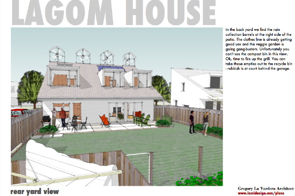
If you've not gotten plans yet, are still waiting for your modern house, or you are hung up with the economy, whatever stands in your way, this is a chance to be part of the story now - no waiting!
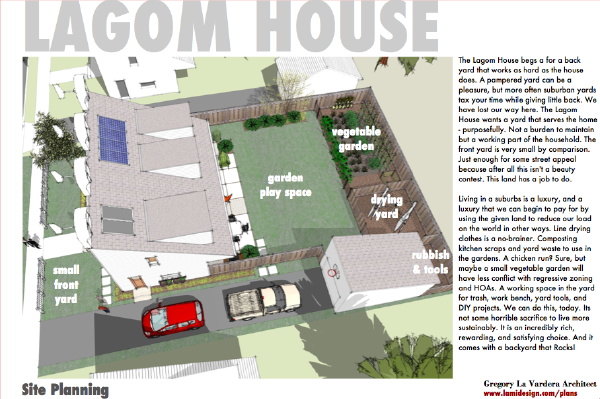
In the end this is just another bid by us for bigger voice in the housing industry, another step towards making the modern house more accessible to the people who want one. What we want to see is for small builders and developers across the country to witness the support for this cause, to see the fans and followers of a modern house plan vendor to receive such passionate support from people who are struggling to someday have a house like these. We want those builders and developers to sit up and notice that there is strong and passionate demand for this kind of house, and it would benefit them to serve this market. Every single modern design entered in this contest can help in that regard, but we sincerely believe that we have the strongest voice - because of all of you.
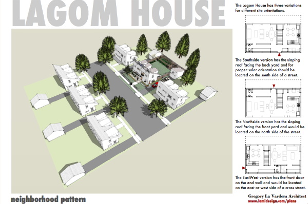
So please - go and vote for the Lagom House. And browse all the entries and vote for all the ones you like. There are so many cool house designs here, it will make your head swim!
Voting is simple - click the button near the bottom of the page, enter your email and the captcha spam buster, you'll get a confirmation email with a link to click, and you are done!


