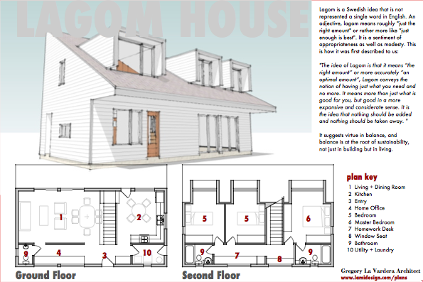
Beginning the presentation graphics for the contest.

The contest allows up to 9 images, and I plan on using all of them simply to increase the amount of info conveyed about the design proposal, to better explain the design. On the contest site they are presented in a grid of thumbnails which I am referring to individual images as "tiles".
The first tile is most important. You need to hook the browsers on that first tile into looking into your design more closely. To that end I want them to be able to grasp the house immediately - visually both floor plans need to be presented, and an image that captures the spirit of the house. Text wise I want to present them with the overriding concept of the home. We want to feed both visual and verbal browsers and entice them to click on to the next image.
The image here is a placeholder, and is obscuring the title text. The final image will have the house on a white background, with house in context images appearing elsewhere in the presentation.
Tidak ada komentar:
Posting Komentar