Minggu, 31 Januari 2010

More 'Kindling Architecture'


Some more fuel for the firewood posts I've been issuing as of late, this is an interesting addition to a house in Estonia that seeks not to blend in with the existing structure, but to call attention to its difference. I'll bet many birds, wasps and other creatures will find it an inviting dwelling, too. Via Freshome – GF

Wright, Stone, Breuer, Johnson, All On Long Island

You'd don't have to look hard to find a community nowadays in which at least a few folks want it to be known that their town or county has a lot of modern houses and that therefore they "played [an important role] in the broader development of Modernism and Post-Modernism in the US." Modern houses are all the rage, as a friend told us a few weeks ago, and everybody wants to participate.

The quote in the first paragraph is from the website of the Heckscher Museum of Art, in Huntington, on Long Island, which has mounted an exhibition called "Arcadia/Suburbia: Architecture on Long Island, 1930-2010."

I saw it mentioned in the Times Real Estate section, which had this to say about star modernists on Long Island:

In 1937, on a relatively small lot in Great Neck Estates, Frank Lloyd Wright used cypress, brick and red tile on the Rebhuhn house. In 1938 in Old Westbury, Edward Durell Stone, the architect of the first Museum of Modern Art in Manhattan, built the Goodyear House, a weekend retreat with curving walls, a flat roofline and large expanses of glass. In 1951 in Lloyd Neck, Marcel Breuer created the Hanson House, using a butterfly roof and fieldstone. And in 1956 in Lloyd Harbor, Philip Johnson built the Leonhardt House, its glassed-in public living areas seeming almost open to Long Island Sound.

Since driving from northern Westchester across the Throgs Neck Bridge and out to Huntington on the Long Island Expressway is a punishment I don't deserve, I'm unlikely to go. But if I lived out there, I'd definitely take a look.

Here's the Heckscher website's exhibition page, and here are some photos (I tried to grab one to use here, but it saved as a QuickTime file, hence no illustration).

What will be the next community with enthusiastic historians of modernism who want us all to know about the great and heretofore uncatalogued modern houses in their town? Someone emailed me today with a bunch of great stuff and I'll try to write about it tomorrow. -- ta

Jumat, 29 Januari 2010

Could this be . . . YOU?

An old friend who lives in L.A., among many hipsters I would think, sent me this wry link. Thanks, Jonathan!  – GF

Ancient + Modern = Lovely Home

This fourteenth century house somewhere, I would imagine by the looks of it, in the Lower Engadin region of Switzerland, has been modernized in a "clean and friendly spirit" (quoting from the Côté Maison article where I found it). Cosy, modern, warm and bright – so inviting! – GF

Kamis, 28 Januari 2010

Contest House - taking the mystery out

There is no mystery to building a high performance house. You don't need unobtanium, you don't need the next greatest clever building material, and most of all you don't need to ask builders to reinvent their material stream and their business model. This is something we can do today.

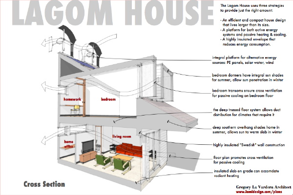
I've mentioned the "Swedish wall system" numerous times as we've worked on the contest house. Its no mystery - we've shown how they build their houses in multiple posts here. So it is no big reveal to show how we are using this approach in the Lagom House. The principle is straight forward - deeper studs = more insulation. We are increasingly moving towards 2x6 studs in the US, so in the Lagom House we step up to 2x8s. This also gives us the opportunity to use staggered interior and exterior 2x4 studs as another step up of performance by eliminating the thermal bridge of the studs. Into this wall we will cram R30 roof insulation. It will need to be compressed slightly to fit, but its the best size readily available to fill the 2x8 studs. We top that wall off with a layer of foam insulation between the sheathing and the siding, again to break the thermal bridge and raise the total R value. Total estimated insulation value - R38.

Now this is not quite what is happening in Sweden. Their stud sizes are not the same as in the US and it appears they use something between a 2x6 and 2x8. Their insulation appears denser than our readily available batts. They omit the sheathing and instead are using a thick dense insulating board which appears to be able to take and hold nails from the siding. This along with heavy thick solid wood siding panels replaces the plywood sheathing that we use on our houses. This kind of panel is not available here, nor is heavy wood siding the norm. In its place we put readily available foam insulation panels over normal sheathing - nothing unexpected for the carpenters.

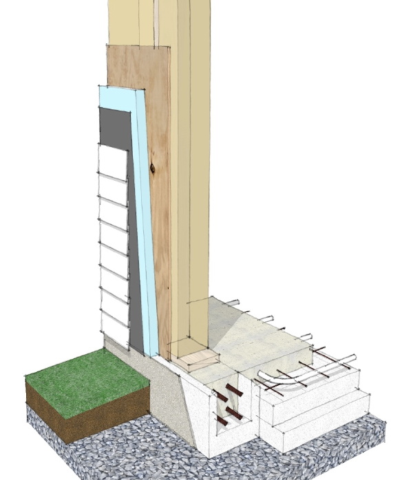
At the foundation we employ the "super" insulated slab on grade type system that is being used in Sweden. This is not used on every house there - again this is considered a step up from their normal slab on grade preparation. But the system of pre molded EPS foam forms is the same, and you can see how this is a progression of what they do on a daily basis. The perimeter grade beam is now separated from the floor slab yet still insulated. The entire slab now receives a thick layer of EPS foam below ensuring that the radiant heat goes into the home and not the soil. Considering the way we typically build foundations in the US, and how much effort and money goes into dumping concrete into a hole in the ground, I am very hopeful that some day we can redirect that effort and money towards a highly insulated slab as we see here.

How about frost and foundation heaving? This is always the concern and what has led the US to require footings extend below frost. Yet in Sweden where the winters are longer and more harsh than most of the US they build their houses without the foundations extending below frost depth. Why is that, and what are we missing? I had a conversation about this with an architect visiting from Norway where they use a similar technique. He said plainly that the ambient temperature of the earth below the frost line is much warmer than the winter air. This is well known - go down a few yards and the earth is about 50 deg, all year. Geothermal heating leverages this. Placing a home on top of the earth in fact shields the top layers of earth and permits that warmer ambient ground temperature to extend up to meet the house, and in fact prevents freezing of the earth directly under the foundation. Its plane and simple - the house insulates the earth from the cold and the natural temperature of the earth prevents freezing and heaving of the foundation. The house raises the frost line. The crushed stone bed that is laid as prep prevents wet soil and freezing from occurring directly below the slab, a well known principle even here.

But why not use SIPs, or ICFs, or straw bales, or any other number of promising building tech? Because 99% of the people building homes right now have never worked with any of that stuff. If they do it forces them to work with new suppliers that they have no track record with, it forces them to estimate time and schedule for work they have not done before and don't know how long it will take. It forces them to work with new subcontractors and learn new techniques. In the long run all these things are good, but in the short run it makes houses more expensive and greatly slows the distribution of energy efficient construction. What we are outlining here preserves all of the know how, the supply train, the business relationships, everything that is already in place. We already know how to do this, and we can begin building homes with near Passive House performance right now.

So there it is, a strategy for building high performance houses, TODAY. What are we waiting for?

Rabu, 27 Januari 2010

Contest House - new contest images

We've created more progress images of our Contest Graphics, this time showing the front and rear of the house with people, and spinning wind generators!


The front yard much as we've shown it before, except for the owners talking with their neighbors that stopped by.


And the backyard again much the same except for the owner firing up the grill while the gals check out the garden.


We have also created a tile that discusses the ideas surrounding the layout of the yard, and our assertion that backyards should become useful again.


And we have added a tile to show the neighborhood, and introduce the plan variations for alternate street orientations for the house.

Jumat, 22 Januari 2010

Comfortably corner bathtub design interior

luxury-corner-bathtub
We would like to see a collection of luxury bath Teuco to Italian society. Appointed 383 This is a collection of minimalist and modern bathroom with shower combination. It was perfect for a modern bathroom. 383 Walk in bath with shower are designed to meet the needs of the whole family, from children to adults and even older. It is a comfortable bathroom with a door that opens inward, with a long lever with a mechanical lock to stop accidental opening. Shower is more than walking, on average, bathroom with shower and access easily through the door without climbing on the tub. Inside, you can easily and comfortably and comes with a seat, spacious and comfortable. Finally a product of compromise. You can find more information on this Teuco luxury bath collection.
Comfortably-corner-bathtub-design-interior

Beautiful red and blue Bathroom furniture ideas

blue-retro-bathroom-furniture
Looks beautiful red and blue Bathroom furniture. Bathroom furniture Topazio stemik retro modern life is a unique collection for any type of bathroom furniture, be it traditional or ultra modern collection offers style.This details, cool retro Contemporary stained by adding timeless silhouettes for a modern look.

red-retro-bathroom-furniture

artistic wood dining table

artistic-wooden-dining-table
Collection of artistic wood dining table is one of the genera minimalist furniture is ideal for adding a natural touch to your dining room. Made of pure wood dining table in the area and the size of your suit. For anyone who loves natural wood to supply their homes, this modern dining room furniture leave a big opening.
minimalist-wood-dining-table

Contest House - caving in to the romance of wind power

Its growing on me. I've got a fever, and the only cure is more wind power.


Yes - I am finding it harder and harder to imagine presenting the house without the wind generators. They just send such an overt message whether it makes complete sense or not. I have to get them spinning in the image.. Well anyhow here is the current state of the front yard. A large light has been added to call out the front door, and hold off the calls for a porch roof.


And here is the current state of the back yard. The rain collection barrels have been added at the right. The clothes line is already in use. And the veggie garden is going gang-busters. Unfortunately you can't see the compost bin in this view. Ok, time to fire up the grill. You can take those empties out to the recycle bin - rubbish court behind the garage.


Kamis, 21 Januari 2010

Vitra Design Museum – another desitnation for "SOMEday..."


Seen on Architecture Lab, the newest addition to Vitra Museum's campus in Weil am Rhein, Germany, (VitraHaus by Herzog & de Meuron, top photo) prompted me to visit the museum's website, which then immediately bumped up the museum's position on my "SOMEday, I will visit this place" list (it is a very, very long list . . . ).

From Vitra's website, "The inception of the Vitra Design Museum dates back to the early 1980s. With the aim of documenting the history of the Vitra company, Vitra CEO Rolf Fehlbaum began collecting the furniture of designers who had influenced the company's development, such as Charles and Ray Eames, George Nelson, Alvar Aalto, and Jean Prouvé. As the collection grew, so did the desire for an architectural venue in which the objects could be displayed. . . Today, the Vitra Design Museum is internationally active as a cultural institution that has made a major contribution to the research and popular dissemination of design. The Museum presents a broad spectrum of topics on design and culture, with a special emphasis on furniture and interior design. Its activities encompass the production of exhibitions, workshops, publications, and museum products, and the maintenance of an extensive collection, an archive, and a research library."

I've also always wanted to go to Vitra's "summer camp": 7–10-day design workshops held at Boisbuchet, at a country estate in the southwest of France. Add that to the list! – GF

Contest House - progressing on site, stay with me

I know I'm going to lose some people here I'm sure, but this is where we insert real life into the modern house picture.


The lot model coming together. Still with the rough massing model but the major elements in place here. House is close to the front, minimizing front lawn and making more space in the back. A veg garden or chicken run if you will is along the back, along with our small drying yard with our favorite suburban icon - the whirly clothes line. Not visible behind the garage is a small work+rubbish yard. The wedge shaped garage sports a basketball hoop, and we have a decent size lawn for play or space for gardening. Immediately against the house and partly under the shelter of the deep overhang is a small terrace. Table and chairs can live outside the kitchen here, and a grill of course. Some more lounge like chairs by the living room completes the back yard.


Meanwhile out front we are tapping a host of domestic stereotypes without irony. A white picket fence lines the sidewalk. A useful divider I think when the front yard is fairly shallow. A front porch - terrace really gives you a place to watch the neighborhood, and yes I know this is begging for a porch roof. It will get one in our catalog, but do without I'm afraid for the contest. Some Adirondack chairs on the porch look welcoming. A few cars in the driveway - a thrifty Honda Fit, and a pick-up for those DIY projects and just moving stuff. Since this is just a progress image - screen grab, I am showing the wind mills just to amuse myself. I will be omitting them in the final images. But love their contrast with the rest of the domestic scene - ultimately this is the way it has to be, right? Our solar panels and flower boxes with have to live together, and more and more that is what will represent a complete domestic picture.


People - we need to populate the model with people. More about that coming.


Rabu, 20 Januari 2010

Village Creek, Norwalk: Connecticut's First Historic District of Modern Houses


We learned some good news while we were driving through the Village Creek neighborhood of Norwalk on Monday. The neighborhood, which consists of 67 houses situated on 37 rocky acres between two tidal inlets, has been named to the Connecticut Register of Historic Places. It's the first historic district in the state whose historic importance lies at least partially in the fact that the buildings are typically modern, an interesting "first" in a state that also includes New Canaan and its 90 or so modern houses.


But Village Creek is also significant because at a time when housing discrimination against blacks and Jews was common, it was developed specifically as a place of racial and religious tolerance. A friend of ours, Tod Bryant, is a historic preservation consultant who prepared the application to the state and national register of historic places (the National Register application will be considered in March). Here's how he described the social goals of Village Creek:

In spite of this climate of discrimination, there were some, often returning veterans, who believed that everyone should have the right to live wherever they chose to live. Roger Willcox, along with his parents, sisters and sisters’ husbands felt strongly that racial and religious discrimination was simply wrong. When they decided to buy land to build a community, they also decided that the community should be a cooperative based on the Rochdale Principles of equality and nondiscrimination. In their 1949 prospectus, the original members of the community stated, “But above all else we wanted a different type of community with a completely democratic character – no discrimination because of race, color, creed or politics.” By including this sentence in their description of their ideal community; they turned the prevailing sentiment of segregation and exclusivity on its head. This principled stance made them heroes to some and enemies to others, but it also made them pioneers in the movement for equal rights. Village Creek’s announcement that it would be a fully-integrated community was an unusual moral stance and it had consequences. The FHA office in Hartford, Connecticut, refused to guarantee loans to Village Creek. Most banks simply refused to finance homes in the development without government loan guarantees, so the majority of the houses built during the first five years were built by the lot owners without mortgages. Conventional mortgage loan financing gradually became available when one of the residents found a sympathetic banker.

Local response to the new community was enthusiastic at first, but it soon cooled and realtors refused to show homes in the subdivision to white families. This situation caused the VCHOA to establish a Real Estate Committee which would show and sell houses.


Considering those origins, it was an interesting coincidence that we drove through the neighborhood on Monday, Martin Luther King Jr. Day. It was cold in mid-afternoon and the bright sun was low and sharp. Three residents were strolling along one of the roads -- there are no sidewalks -- and since we were driving very slowly in an area that does not get a lot of traffic, we thought it would be considerate if we stopped and told them that we were essentially tourists who came to look at the houses. They were very polite and told us that the application for listing on the state register had just been approved. We said we were glad to hear it, and we drove off.

I liked the neighborhood. The original hope for mid-century modern houses was that they would be relatively inexpensive, modest, efficient and beautiful places to live for the masses. Village Creek is not exactly that but it comes close. It's very clearly a neighborhood that people live in, rather than a collection of mid-century modern showpieces that people shine up for tours.

Here's what Tod wrote about the architecture of Village Creek:

Village Creek embodies both the spirit and substance of the Modern movement in post-World War II America. The spirit is embodied in the progressive ideas included in its governance and its substance is embodied in the design of it buildings. The VCHOA Architectural Control Committee (ACC) required that new homes be built in the Contemporary style which it defined as, “… we interpret “contemporary design” to stress; low pitched or flat roofs, horizontal rather than vertical lines and a leaning toward large glass areas.” The ACC has been successful in its efforts and Village Creek still possesses the look and feel of a forward-looking progressive development. These design requirements made Village Creek a leader in the Modern movement that was growing in the United States. It was being developed at about the same time that Phillip Johnson was building his Glass House in the neighboring town of New Canaan, Mies Van Der Rohe was completing the Farnsworth House in Illinois and the Case Study houses were being built in California by Richard Neutra, Charles and Rae Eames and others.

We took a couple of quick photos from the car of houses that happened to be easy to see from the road. The first was designed by an architect named Sidney Katz of Architects Associated in 1950; the other was built in 1957 and is lived in by the original owners. Here's a map showing Village Creek. (Split Rock Road, Dock Road and Outer Road) If you go there, please respect the residents' privacy. - ta

Contest House - a compact siteplan to match a compact house

As I am mocking up the site now, simply to serve as a background for exterior images of the house, I turn to some inspirations for suburban site planning that I think are still very relevant today.

Many years ago when I was still an architecture student I did a self-defined design studio project for designing a suburban subdivision. You have to realize how out of step that was with studying architecture. The suburbia, particularly residential suburbia was an architectural desert. Yet I took a semester to study how we carried out suburban development and the way we made houses, and suburban infrastructure. It was 1984 and most of my naive work as a student predated the New Urbanism movement. My project book is probably still on the library shelf in the architecture school library at Rensselaer Polytechnic Institute. Go look it up if you are curious.

Anyhow back then I dug into a few dozen "pattern books" - that would be catalogs of stock plans - from the library published in the 1940s. Just like today they were full of current as well as reasonable recent designs - things from the 30's and 40's. I was taken with the way they presented the houses, usually with all the plans and elevations presented on one tidy letter size page. Often the ground floor of the house was presented with a rendered site plan - hypothetical - but significant as it demonstrated how the house could be integrated into the site. In a word the site plans were wonderful. These were different days and suburban lots were much smaller than normal today, and the middle class expectation was smaller as well. Yet these siteplans presented a rich and functional environment for these house plans. I had copied some of my favorites from those books all those years ago, and this morning I dug them out of the file in my basement as they were on my mind as I worked up my site plan model. Lets look at them:

The first comes from a house plan simply titled Design for a Six Room House. How great is that! It is a 3 bedroom house. The first thing I should point out is the size of the lot is 35ft wide, and 125 ft deep. That is a small lot, unheard of today. The house has a front loaded garage, unusual for that time, but its near impossible to pass the house to a garage out back. So what do we have brewing in the yard? About half of the yard is dedicated to a Walled Garden. This garden is off the living room and is shown with some stone paving. This would be the extend of the pleasant outdoor living space. Directly behind it is a smaller yard, divided by the garden wall called a Playground Truck Garden or Poultry Run. Dig that - either a small yard for the kids to crash around in, or someplace for your chickens! Very practical. The other half of the yard is taken up by a long space simply called a Drying Yard. Two long clothes lines are shown with a paved walk between them. Again, how practical that you would dedicate nearly half your outdoor space to productive outdoor uses. I won't go on right now about the vilification of clothes lines in suburban America - its been looked down on as lower class and this is a grievous injustice. We all need to save energy, and experience the joy of fresh line dried items. Behind the drying yard is a small space set aside for rubbish and yard work implements - and horrors - a home incinerator! We actually have a relic of one of those in our own yard! All in all I love the purposefulness of these structured yards, and the way they serve the home - not as a burden to maintain, but as a working part of the household. The front yard is very small by comparison - just enough for some street appeal because after all that land has a job to do.


The next is called Design for a Five Room House - surprise! This time on a 30ft wide lot, again 125ft deep. But this design benefits from an alleyway with rear access to a detached garage. Again we have a main garden space, this time shared with play space. Behind it is a poultry or dog run. Yes, not that long ago many of us kept chickens! The other side is again dedicated to a drying yard, and a rubbish and work space behind it. So useful, so civil, so well considered. What has happened to us? A home bought today comes with graded dirt in the yard, if you don't spring for the extra sod. We have certainly lost our way here - all that land to tax your time, to maintain, but never giving anything back. And we all know that it so wants to! Chickens, or a small vegetable garden, enough lines to really dry all your laundry, a discrete place for tools and trash, and a limited area to enjoy as well as a limited area to manicure.


The last is a more familiar proportion lot at 50ft wide by 100ft deep. Nearly the same as our contest house presumed lot. Here they manage to pass the driveway by the house - much more willing to squeeze the driveway against the house than we seem to be today. In the back the drive widens to an Auto Court serving a two car garage at the back of the lot. Again we have a walled garden, a drying lawn, and a playground truck garden or chicken run. The front yard is very small, and the rear yard is maximized.


I think the practices we see in these old site plans suit our sustainably trending present. Living in the suburbs is a luxury, and a luxury that we can begin to pay for by using the given land to reduce our load on the world in other ways. Line drying clothes is a no-brainer. Composting kitchen scraps, and yard waste to use in the gardens, chickens sure, but perhaps a small vegetable garden will come in less conflict with regressive zoning regulations. A working space in the yard for trash and work bench and yard tools - and DIY projects. We can do this people. Its not some horrible sacrifice to live more sustainably. It is an incredibly rich, rewarding, and satisfying choice. And it comes with a backyard that Rocks!

Selasa, 19 Januari 2010

Taking the old woodpile to an entirely new level


I have mentioned stacked wood or kindling in a couple of posts recently, but this takes the cake! Wonderfully clever and beautifully conceived design for a studio by Piet Hein Eek for friend, client and musician Hans Liberg. Seen on Trendir modern house designs and Gismodo. Photos from Thomas Mayer Archive. – GF

Contest House - building context

The next step is creating exterior images of the house, in a schematic context - that means we need to build a little neighborhood.


The individual lot, compact, small front yard in order to maximize the rear yard. The detached garage provides some alternate storage in the absence of a basement. The house I grew up in sat on a lot this dimension - 60ft x 100ft, so I feel very familiar with the scale of this density.


While a neighborhood full of Lagom Houses is unlikely to start we'll present an idealized context. The houses on one side of the street are the second plan variation for the proper street+solar orientation. We will be replacing the lot in the center with a more detailed site model that has the more detailed house model plugged into it. This part should be fun. As the modern house is so often cast as aloof and minimalist we will strive our hardest to present it as domestic and lived in.

Senin, 18 Januari 2010

Modern Neighborhoods


Coincidentally while I was working on a post just now about Village Creek, a mid-century modern neighborhood in Norwalk that (or so we were told) was recently listed on the National Register of Historic Places, Gina found a post on Build Blog, with photos of and details about five mid-century modern communities around the country, and a list of six others (nothing about Usonia, in Westchester County, though).

Build Blog highlights Hollin Hills, in Virginia; Arapahoe Acres, in Colorado; Hilltop, in Washington; Six Moon Hill, in Massachusetts; and Krisana Park and Lynwood, in Colorado.

Here's the post. (I helped myself to the photo, which Build Blog says is from the University of Washington Libraries.) - ta

Contest House - to show wind generators or not

Should the first image we show of the house have it topped with wind generators, or not?


Here we see the house with the wind generators - but the inside of the shroud has been painted white to reduce the contrast we were seeing in the previous image, or...


..do we dispense with showing wind generators for now and let the house forms stand on their own for the time being, solar collectors still in place.

I have to say that I think I like the interaction between the wind mills and the overlaying title letters, where as without them the house appears simpler and cleaner. But I tend to gravitate towards noise and complexity. We are still going to show the the wind mills in the image in Tile2 where we describe the characteristics of the house. Thanks for the great active feedback I've been getting all through this process.

Minggu, 17 Januari 2010

Contest House - second tile

Doing more mocking up of presentation tiles today.

First draft of the second tile. We want to launch here right into the important characteristics of the house design on the second tile. A section cut-away begins to give us a feeling for the space inside the house, as well as the overall structure. The three strategies for making house lagom are described at the top of the tile:

- An efficient and compact house design that lives larger than its size.
- A platform for both active energy systems and passive heating & cooling.
- A highly insulated envelope that reduces energy consumption.


Here another draft of the first tile. I was not sure if I should present the house right here with solar panels and wind generators on the roof. I decided to move the roof scape up to be partially obscured behind the "Lagom House" title to subdue them a bit. I welcome feedback on this - should these alternative energy accessories be flying on the first tile, or should they be introduced as options later on?

Contest House - first tile

Beginning the presentation graphics for the contest.

The contest allows up to 9 images, and I plan on using all of them simply to increase the amount of info conveyed about the design proposal, to better explain the design. On the contest site they are presented in a grid of thumbnails which I am referring to individual images as "tiles".

The first tile is most important. You need to hook the browsers on that first tile into looking into your design more closely. To that end I want them to be able to grasp the house immediately - visually both floor plans need to be presented, and an image that captures the spirit of the house. Text wise I want to present them with the overriding concept of the home. We want to feed both visual and verbal browsers and entice them to click on to the next image.

The image here is a placeholder, and is obscuring the title text. The final image will have the house on a white background, with house in context images appearing elsewhere in the presentation.


Jumat, 15 Januari 2010

Like being in 2 perfect places at once


This may not be the absolute best execution of a fabulous idea, but I'd happily accept it! Combining two of the best things you can do after skiing or otherwise experiencing a winter's day: a hot soak in the bath, and sitting by the fire. Brilliant!

Also in the same house is more stacked-firewood-as-interior-design-element, harking back to this earlier post. Seen in the current Côté Est Dec. '09 – Mar. '10 issue (story: Le design atteint des sommets) – GF

Modern living for the birds


Seen on Fast Company, this is what I've been waiting for: a great-looking chicken coop (really . . . no joke.).

Designed by Andreas Stavropolous, about which Dwell writes: Andreas lives in Berkeley and is a registered landscape architect in the state of California. He is the founder of XS LAND and teaches at Yestermorrow Design/Build School in Vermont. He is also the co-founder of ChickenCribs.com, home of the modern, self-assembly urban coop. He is interested in involving the mobile studio in grassroots design efforts and continuing to experiment with small scale dwelling and working units. He can be contacted at andreas@xs-land.com – GF

Minimalist mountain chapel


Built in 2008 as a private memorial, this honest, lovely little 'bergkapelle' on a lower alp near Andelsbuch, Austria, is made from timber from the site, and the stones for the foundation were brought from further up the alp. Architectural firm: cukrowicz-nachbaur Photos: Andreas Cukrowicz, Hanspeter Schiess – GF