Kamis, 31 Desember 2009

Happy Birthday, home!


As modern houses go, ours is hardly of the category that John Johansen, one of the Harvard Five, called "high modern." And it's certainly not International Style, like Edward Durrell Stone's classic Mandel House, over in Bedford Hills (and built six years before ours). When Christian Bjone, a historian of modern architecture, visited us a few years ago, he gave the house the once-over and called it an evolutionary dead end, explaining that in the early days of modernism, architects would try various styles and techniques, and if clients did not materialize, those styles and techniques were dropped (he actually liked the house and managed to say this in a way that did not sound disparaging). Given that it was built in 1939, I'm not even sure if you could call our house "mid-century modern" -- I'm more comfortable calling it pre-War modern, a category that just occured to me now.

Because 2009 is the 70th anniversary of when the house was built, and because 2009 is about to end, Gina asked me to gather what I know about the house, the architect, and the original owner, and write something for our blog. She has assembled photographs that show the house as it was when it was built and as it is now.

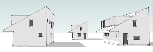
The house was designed by Moore & Hutchins, a New York City firm founded in 1937 by John C.B. Moore and Robert S. Hutchins. Their client was an attorney and law professor named Bertram F. Willcox. Moore and Willcox were friends. The house was designed for weekends in the mild months, spring and fall, and Moore and Hutchins designed another house next door, as a weekend place for Moore and his wife. Because of the friendship, and because Moore's own house was nearby, we've always assumed that Moore was responsible for most of the design, although in truth we know next to nothing of how Moore and Hutchins worked together, and both the Willcox house and the Moore house could have been complete collaborations.

Moore was born in Providence, Rhode Island, in 1897, and died in Needham, Massachusetts, in 1993 (modernism promotes longevity, Johansen, himself in his 90s, once joked). He graduated from Harvard and got an architecture degree in 1927 from the Ecole des Beaux-Arts in Paris. The Lost Generation and all the modern writers and painters in its circle were flourishing in Paris then (and the Bauhaus school was flourishing in Germany), and it's easy to imagine that a young architect studying there would be influenced by it all.

By the early 1930s Moore was back in America. He helped design a house for the Homes of Tomorrow Exposition at the 1933 Chicago World's Fair, an exposition that "demonstrated modern home convenience and creative practical new building materials and techniques." The house Moore worked on was called the Design for Living Home and is shown in the left column of this webpage. A few years later he helped design the Home Building Center at the 1939 World's Fair. He was appointed to the faculty of Columbia's architecture school in 1936 and taught there until 1944. John C. B. Moore, An Architect, 96 – June 25, 1993

(Because it's our guess that Moore designed our house, I've spent more time looking up information about him than about his partner, Robert S. Hutchins, but here's Hutchins's obituary, from the New York Times. Robert S. Hutchins, An Architect, 83, Of Public Buildings – January 1, 1991
)
We're lucky in that many of the buildings deigned by Moore & Hutchins were photographed by the Gottscho-Schleisner photography team – Samuel H. Gottscho and William H. Schleisner – and that the Gottscho-Schleisner collection of 29,000 photos is housed in the Library of Congress and can be found online.

The collection includes dozens of photographs of our house, the house next door, taken in 1940 and 1941, and two houses that Moore & Hutchins designed on Long Island, and scores of photos of the firm's other work, particularly Goucher College, in Towson, Maryland. In 1938, Moore & Hutchins won an international competition to design Goucher's campus. It is now on the National Register of Historic Places. Here's what the state of Maryland's national register website says about it:

The Towson property was purchased in 1921 and a "by invitation" architectural competition, approved by the Baltimore Chapter of the American Institute of Architects, was held in 1938 for design of the overall campus plan and the library. The entrant list reads as a "who's who" of the architectural world with representatives from the new Modern movement as well as architects with more traditional design philosophies. The winner of the competition, Moore and Hutchins, went on to design more than nine buildings on the campus and played an active role in the master planning for future campus development until about 1956. Their building designs, while modern in philosophy, take cues from the indigenous materials of the area and the vernacular architecture of Maryland. It is to their credit that the buildings designed by Moore and Hutchins remain in use with their original functions and maintain a high level of integrity. As a result, Goucher College is significant for reflecting the architectural merit of the overall campus.

Moore & Hutchins also designed buildings at Princeton, St. Lawrence University, SUNY Binghamton, and Columbia; Fox Lane High School in Bedford (where our daughter is a student and which was completely renovated two years ago) and Highland School and East Hills School, both in Roslyn on Long Island. They also designed an expansion of the New Canaan Library, and the village hall and the firehouse in Garden City, Long Island, the latter of which, to my eye was clearly based on the design of our house.

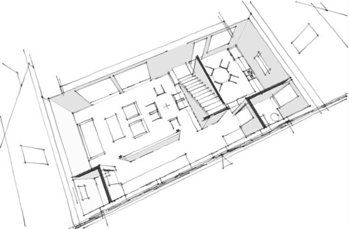
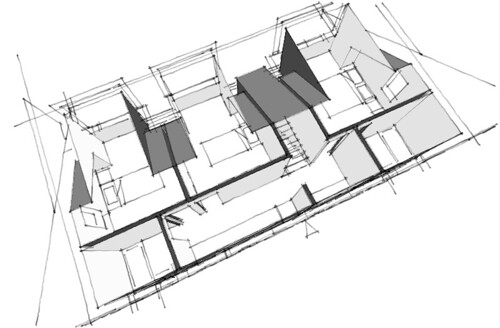
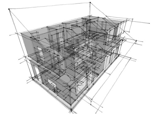
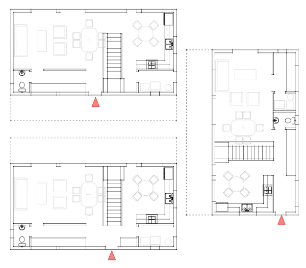
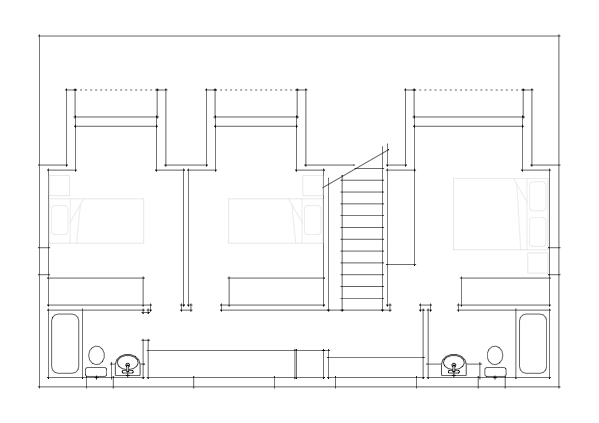
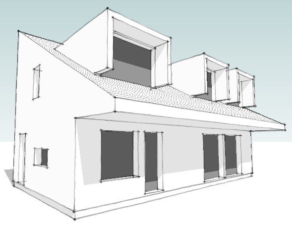
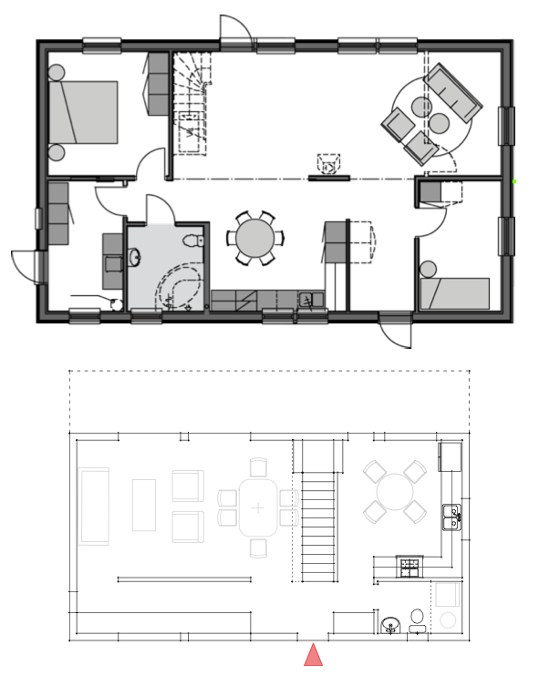
Our house was 1,865 square feet when built and cost about $8,000. Like Goucher College, the design was "modern in philosophy, [and took] cues from the indigenous materials of the area and the vernacular architecture." It had three small bedrooms – one on the first floor and two upstairs – a screened-in porch on the south end of the first floor, and a partially-covered deck, reachable by an exterior staircase in the front of the house, on the second floor. The outside of the house combined vertical and horizontal clapboard made of red cedar. The living room was dominated by a fireplace made of massive stone slabs and a fieldstone hearth and chimney. The house was barely insulated and had a small heating system in a room on the first floor.

It was innovative enough to be listed, in 1940, in a small, spiral-bound guide to modern architecture in the northeast, published by the Museum of Modern Art.

Willcox didn't own the house for very long. The next owners (I've never bothered to look up their names) removed the first-floor porch and expanded the living room in its place, relocated the exterior stairs and the living room window, dynamited a cellar (the stone is still piled on our property) and put the heating system down there, and expanded the first floor about eight feet to the west, over the new cellar. In notes that I made several years ago, I wrote that the new owners worked with Moore & Hutchins on the changes, but I have no idea now what the source of that information was.

In 1949, Gina's mother and father, Helen and Gene Federico, were living in New Canaan, renting Marcel Breuer's house with Helen's sister Muriel and her husband, Joe Hinerfeld. They were looking to buy land to build on or houses to buy, and to move out of the city. Using the MOMA guide, they looked at the Willcox house. The Hinerfelds decided to buy it; the Federicos bought five acres through the woods and built their own modern house on it.

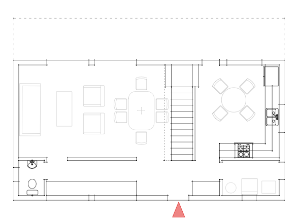
We moved into the house in the spring of 2000, a couple of years after Joe Hinerfeld died. We added a master bedroom on the second floor and, under it, a play room/family room on the first floor, an addition of about 700 square feet. We converted the original master bedroom, on the first floor, into a mud room and put in a new front door. We also put in a new kitchen, with glass doors that lead to a new deck on the west side of the house, and took down a wall to make the kitchen and dining area one room. In 2009 we replaced the second floor deck and enlarged it slightly. Not including the decks, the house is now about 2,800 square feet, or 1,000 square feet more than the original.

It is not a perfect house but it's a good one. The master bedroom, which Gina designed, is beautifully proportioned and never fails to lower my blood pressure when I enter it. In cold weather, the fireplace makes the living room, dining room and kitchen warm and inviting. In good weather we open the glass doors (also Gina's idea) and the four west-facing double-hung windows, to let the outside in, and the deck outside the kitchen and on the second floor become additional rooms, where we eat, read, nap.

After Joe Hinerfeld died, in 1998, we weren't sure if we wanted to keep the house or sell it. We consulted a local real estate agent, a woman whose ex-husband himself was an architect with a modernist bent. She told us how much she thought we could sell it for, and then she told us that it was without doubt a tear-down. Whoever bought it, she said, would replace it, probably with a faux-Colonial. Needless to say, we're glad we didn't let it go. – TA

Photos
Top: 1940 – 1941 Gottscho-Schleisner Collection, Library of Congress
Bottom: 2005 – 2009 Gina Federico


Sabtu, 26 Desember 2009

Contest House - solar orientation, street orientation

Orienting a house design to the sun is easy. But put it on a small urban/suburban site, introduce a street grid, suddenly everything may not be going your way.


We admit that we've designed ourselves into this corner to a degree. We've made a decision to use an asymmetrical massing for the house which in turn dictates which way the house massing must be oriented for the sun. Its not completely a fabrication however as the asymmetrical profile does serve the small footprint of the house allowing us to make a 1.5 story design on a narrow dimension. But it does impose restrictions such as the dictate on solar orientation. Working with such limits introduces compromises which can be at once necessary and pleasing as they can create unexpected quirks or complexities to a design. And so we have here with our Lagom House as we strive to create variations on the design to accommodate different site orientations while maintaining the necessary solar orientation.


I've hinted at this in the past posts on the design process as I've been developing all three versions of the house concurrently, yet I've been using only one to share the progress of the design. So new we have three prototypes, two for streets running roughly east west, one for the north side of the street with the sloped roof facing the street, and one for the south side with the sloped roof facing the rear yard. The third version for north south streets slopes the roof towards the side yard.


The south side version is what we've been looking at, so lets look at how the floor plan shifts for the north side. The ground floor plan is essentially the same except for the flip of the relative direction of the stair. The front door shifts slightly towards the living room, and the foot of the stair is now right beside the entry foyer. This is not at all a bad arrangement and still retains the ability to step up and through the landing and proceed to the kitchen. A little bit more subtle is the change in orientation for the bedrooms, now facing the front yard rather than the back yard. This is not a great compromise in privacy, but some people may have a distinct preference.


The east west version makes greater compromises. First the plan never really makes an complete change over to the narrow deep orientation as it still relies on access to a reasonable side yard. The kitchen retains a door now on the side of the house, and the living areas dual doors are now shared one on the side and one to the rear. The entry consumes a good portion of the "service corridor" portion of the floor plan in this scheme. While there is a bit more storage as a result the home office area and utility room suffer for the loss of space to the foyer. It is possible that some of the mechanical equipment could find a place under the stair or in the new storage cabinets running on the outside wall between the kitchen and living room, but I did not want to assume that while laying out the plan.


Selasa, 22 Desember 2009

Contest House - upstairs, the bedrooms

We've shown the development of the massing and the ground floor plan, but before we proceed to the solar orientation variations on the house we need to look at the second floor.


Each bedroom includes a dormer that extends the area of the room to a tolerable size. These are not big bedrooms - they are for sleeping, really not much room for a lot more than that. I think the closet space is good however, and if done with a wardrobe unit it can eliminate the need for a freestanding dresser which there is not really room for. If you can do that you will have room a chair by the window. At the top of the steps is a large window with a window seat. This may or may not be desirable depending on your site, but its a nice opportunity for a unique sitting place that makes the house live larger. Also in the upstairs hall is the kids homework desk - a long affair wide enough to manage two kids, computers, and crafts. Some space is reserved for a hall linen cabinet as well. Then we have two bathrooms at opposite ends of the house. The hall bath for the kids, and the slightly larger bath off the master bedroom. The hall also can provide access to an attic level HVAC unit if needed. The attic space is not large, but can provide needed mechanical space depending on the mix of equipment you need for your region.


So there is the basic second floor arrangement.


Sabtu, 19 Desember 2009

Contest House - having our cake and eating it too.

Discussion on the previous post led me to work the floor plan some more seeking to gain back the legitmate laundry + utility room, and the ground floor powder room we believe Americans will demand.


Just not comfortable with the combination powder room + laundry + utility room from the first go round of the floor plan, we dove back in to see where we could possibly trim fat. Well the answer it seems was staring us in the face, and that was the 16 feet of available desktop space in the home office area. Now 16ft would be great, especially if you wanted to accommodate two people. But we will have an upstairs "homework" desk for the kids so we don't have to have space for them here. Plus having a legitimate kitchen table also makes a great place to do homework. So we resolved to carve a tiny powder room out of the home office.


The result is still over 12ft of desktop length. Certainly enough for two people, or the option to have a vertical storage cabinet. The powder room is small and will require a tiny wall hung sink, but a small compromise really. Meanwhile back on the other side of the plan we have the old combo space now completely dedicated to laundry and utilities. I'm relived that I can make more space here because it widens the options for HVAC systems. This is important if people want to include a solar water heating system or AC air handler or whatever is appropriate for their climate. Side by side rather than stack laundry is also possible if your HVAC needs only one piece of equipment. We can also gain an entry door through the laundry + utility room, which is not something everybody wants or needs, but if you like that direct access its great that you can have it in this small floor plan.


The developing massing model is a bit more informative than the prior wire-frames. The next step is revisiting the alternate floor plans. With the massing of the house having such a definitive solar orientation we now have to consider the situation where the house could be on the other side of the street. In other words facing the wrong way for our solar platform. We also have to consider street orientation - currently it works on a street running east west, but how about north south streets. We need a variation that has a front door on the end of the house.

Kamis, 17 Desember 2009

Small budget for modern office interior design

Small-budget-for-modern-office-interior-design
If you want create modern office with small budget you can see this minimalist office photos. Its can give you inspiration for build modern office with small budget. It’s modern minimalist office interior design with small budget including conference/waiting room, lounge, entry and pantry/office. Photos modern office take from Arkadium office..sourche architechome.com

arkadium-office-with-small-budget

Modern school architecture with amazing interior design

Modern-school-architecture-boys’-school
These Modern school architecture with amazing interior design. St. Albans School known as boys’ school. Its The architects took advantage of the location and created amazing interior and exterior passage areas, which join the buildings. Also, a completely new construction was raised, named Marriott Hall, which provides and aesthetic contrast with the rest of the project. source architechome.com

Beautiful Christmas tree photos collection 2009

Beautiful-Christmas-tree-photos-collection-2009
Its the most beautiful Christmas tree decoration. The artistic Christmas tree complete with Christmas tree accessories decorate this room. Modern fireplace make warm this romantic room with background artistic white wallpaper, make comfortable this room to celebrate Christmas 2009. source architechome.com

Rabu, 16 Desember 2009

Contest House - comparing plans

The compact size of our proposed design triggers a series of compromises. We look at the plan of the typical Swedish catalog house to see if we can gain any insight.


Part of our effort to keep the footprint of the contest house design small also limits our options. We want the living spaces to feel spacious and open, yet our experience is that running any interior room from side to side in a house actually contributes to it feeling smaller. Somehow the presence of a "space beyond" where you are, or a "space between" here and there can contribute to a home feeling perceptually larger. When a house is small this becomes an important consideration.


I've placed the plan of the Anebyhus Lygnern design above the sketch of our contest house plan. The first thing we notice is that the Swedish house is essentially a 1 story design with two bedrooms on the ground floor. Officially it is what the Swedes call a 1.5 design, or a one story house with the option for the finishing of the second floor. That option would add 3 bedrooms, a bath, and a common family room to the home effectively doubling its size. With the upstairs finished the house tops out at around 2000sqft, 33% more than our target of 1500 sqft.


Yet there are significant things going on in the Swedish plan that save space. Things that are considered floor plan "poison" in the US. These are not criticisms of the Swedish design, but rather highlights of different cultural expectations in the US and Sweden. First of all the master bedroom shares its bathroom with the secondary bedroom - no private master bath. Compounding this is the bathroom is also doing duty as a powder room for guests. The second bedroom is also awkwardly located right at the entry foyer. Now if the second floor was completed, all of these issues resolve - the second bedroom becomes an ideal home office. But we will still find only one shared bathroom upstairs. Yet all of this shared bathroom saves space and makes for the opportunity for a very useful utility/laundry room. This is something that we are forced to sacrifice in order to create a first floor powder room. Utilities and laundry relegated to a closet in the same space - not a flexible solution. The American expectation for a master bathroom, and the awkwardness of sending a guest upstairs to find a bathroom puts us in the difficult position to provide 2.5 baths in a compact 1500 sqft home. Yet if we can package these desires into a plan at this size we've put good value and greater market appeal into a small house.

2010 Christmas accessories photos collection

christmas-accessories-arrangement
To celebrate Christmas we have to prepare decorate our home with many Christmas accessories such as Christmas tree, Christmas snow, Christmas candles, Christmas ornament etc. You can see the beautiful Christmas home decorating photos. There many Christmas decorating interior photos collection to remodeling your home. source javabali.info

Menciptakan ruangan romantis dengan bunga

flowers_for_romantic_living_room
Sebuah rangkaian bunga yang indah dapat digunakan sebagai titik fokus dan memberi kesegaran di dalam rumah. Bunga dapat digunakan untuk memperindah tampilan interior Anda. Warna bunga yang ingin Anda gunakan untuk menghias ruangan harus disesuaikan dengan warna dominan ruang. Bila warna dinding atau furnitur di ruangan cenderung gelap, beri sentuhan lembut pada rangkaian bunga dengan warna-warna cerah. Gunakan bunga di warna berani seperti merah atau kuning agar lebih menghidupkan. Warna bunga dapat menentukan nuansa yang ingin membuat pernyataan atau disajikan dalam sebuah ruangan. Seperti merah yang kuat dengan unsur romantis atau putih yang membantu memberi kesan bersih dan lega pada ruangan. Gaya tropis, juga dengan lebih banyak menggunakan unsur hijau daun dan paduan dari berbagai jenis daun. Ruang-ruang yang perlu ditambahkan ke nilai estetika bunga di antara kamar tidur, ruang makan, kamar mandi, ruang keluarga dan ruang keluarga. Warna yang cocok untuk ruangan ini termasuk diingat romantis merah, atau putih dengan kesan lembut. Lavender yang menenangkan juga cocok diletakkan di kamar tidur, karena di ruangan ini yang Anda butuhkan untuk merasa rileks untuk beristirahat setelah seharian kegiatan. Sementara ruang makan dapat menggunakan warna-warna seperti kuning, misalnya bunga matahari. Warna bunga melambangkan kebahagiaan, sehingga Anda dapat memasak atau makan bersama keluarga dengan nuansa ceria. Untuk kamar mandi, bunga yang diperlukan antara lain lili putih dengan aksen berry atau buah-buahan mini lainnya. Selain itu, juga dapat dikombinasikan dengan rangkaian lavender ungu. Sirkuit ini sangat tepat untuk menciptakan suasana yang nyaman di kamar mandi, sehingga Anda merasa nyaman ketika masuk ke dalam kamar mandi. Terutama jika Anda memiliki bak mandi untuk mandi. sumber architechome.com

Tips menata ulang interior rumah dengan biaya terbatas

redesign+and+makeover+living+room+design
Untuk mempecantik desain interior rumah, kita dapat mengatur ulang furnitur dan aksesorinya. Berikut tips tentang cara untuk menata ulang perabot Rumah dengan biaya terbatas. Mengatur kembali perabot dan aksesoris rumah dengan biaya terbatas dapat Anda lakukan untuk ruangan terlihat indah dan nyaman. Memperluas wawasan Anda dengan sering melihat model furnitur di kafe atau restoran favorit atau majalah desain terbaru. Namun, tidak dengan membeli item ini karena Anda memiliki dana terbatas, tetapi dengan membuat atau membeli model yang cenderung mirip secara visual, tetapi lebih sederhana dalam desain dan tidak menggunakan bahan-bahan mahal. Istilah mungkin Speck turun. Dengan pengaturan dan kombinasi dari pengaturan yang ada di majalah, Anda mungkin akan terkejut dengan apa yang Anda dapatkan. Anda tidak memiliki dana untuk mengganti sofa dan kursi. Gunakan penutup sofa atau kain untuk bahan menarik dan sesuai dengan tema keseluruhan ruang Anda.Tambahkan aksesori jika perlu dan buat penutup bantal dengan warna pilihan Anda. Aksesoris rumah kayu Jauhkan aksesori simpel.Kotak menempel pada dinding atau rak, rak-rak kayu yang muncul mengambang di dinding akan meningkatkan gaya rumah Anda. Kehati-hatian Anda dalam mengatur item untuk ditampilkan dan untuk memilih aksesori yang sesuai dan cocok akan membuat ruangan Anda terlihat menarik. sumber architechome.com

Selasa, 15 Desember 2009

More cool architecture to rent


In the same vein as my previous post, this building in the old town of Zug, Switzerland, whose architectural history dates back to the 15th century, has recently been renovated creating 3 distinctly functioning spaces to rent for a gathering or banquet, or for short-term occupancy. Part of the Rough Luxe family of hotels, Vorstadt 14 is where "modern quality complements real history, tradition meets with avant-garde".
"Originally a private residence, the building has been given a new identity which, under the name "Vorstadt 14" combines temporary home style living with vibrant culture. The three units FACE, BRAIN and SOUL, for individual let, all offer an exclusive environment for art and design.

Apart from all the usual advantages you would expect of a modern art/design gallery, our FACE room provides functional and contemporary infrastructure and is ideal for banquets, cocktail parties and other social events.

On the other hand, the business suite, BRAIN – which can be rented for several days or weeks – provides the amenities and comfort of a hotel. If required BRAIN can be combined with a short-term lease of the FACE facility, should you plan a meeting or a banquet.

Finally, the penthouse, SOUL – to be let privately – will also be available for public access on special occasions."


Seen on wonderful Plastolux. – GF

Contest House - first sketches

I've begun sketching out the massing of the house - wireframe drawings posted


I am planning on using a single slope roof with the intention of the house facing sunward, so that the upper portion of the roof slope can form a platform for solar collectors. Its functional, but also a design element - overtly stating its purpose through its form. Solar collectors could be placed on a conventional roof profile but that would make less of a statement. Scott and I are having a bit of a debate about this right now. He feels that profile is too much "design statement" and not enough "design solution". We don't agree here, and I acknowledge that the kind of modern houses in the Swedish catalogs are much more modest in their architectural exuberance. Yet compared to the range of wild design themes often used for high end modern houses, and the quietness of authentic vernacular homes, I do think I'm striking a good balance. Not only here but in the design themes of most of our house plans.


I'd love to hear readers opinions on this. I know there is not much here to react to yet, but you could look back to the XHouse3 for example and have the same discussion. If we want modern to live in the mainstream of home building in the US, what is the proper level of design? How far do we push it, how extreme or modest is going to be successful in the wider market?


example of swedish modern/traditional (MoTrad) house: Anabyhus Lygnern


Senin, 14 Desember 2009

Architecture you can try on for a week or so

For a long time now, it's been possible to rent a historic building for a vacation or a specific event in the UK through The Landmark Trust, which aims to preserve the buildings by putting the rental proceeds toward their upkeep. They hope to promote enjoyment of historic buildings by enabling as many people as possible to experience living in them for a short time.

The people who created Living Architecture felt similarly, and that creative, Modern-influenced architecture in Great Britain was either experienced in a transitional, passing-through sort of way, or was privately owned by only a very few, inaccessible to the public.

They say about themselves: "The inspiration for Living Architecture came from a desire for people to be able to experience what it is like to live, eat and sleep in a space designed by an outstanding architectural practice.

Living Architecture has asked a series of established and emerging world-class architects to build houses around the UK. The houses will be available to rent for holidays by the general public"
The houses all seem to still be under construction, but you can follow their progress at Living Architecture's blog.  Houses are expected to be available for holiday rentals in the spring of 2010. – GF


Minggu, 13 Desember 2009

Contest house - owner profile and our guiding principle

The Who's Next contest did not provide a list of rooms or size for the home, but rather a profile of the owners leaving the contestants to determine the appropriate response.


We are really left to make the size of the house as we see fit which should elicit a interesting range of responses from contestants. We have elected to use the "Starter House" profile offered by the organizers. The profile tells us the owners will have 1 or 2 children, so we are going to take that as a need for a 3 bedroom house. We want to keep the house compact, and to us that means pushing the boundaries of what we already offer in our catalog. So our goal is to make this home design smaller than any other 3 bedroom house in our collection. In keeping with the idea of a "starter house" we are shooting for 1500 sqft. A home office is called for in the profile but to hit our target size its doubtful we can fit a home office the size of a 4th bedroom. There are many more factors from the profile, some of which we may or may not be able to satisfy within the size limit we are imposing. But that is our choice and points towards what will be our guiding principle for the design.

Scott Hedges introduced us to a Swedish concept, an idea that does not have a single word representation in English. The word is "lagom" (sounds like La-Gom) and in Sweden this is an idea which underlies much of the culture and disposition of the Swedish people. An adjective, lagom means roughly "just the right amount" or "just enough is best". Its a sentiment of appropriateness as well as modesty, quite the polar opposite of the driving motivation in the US of more is (almost) always better. We don't have a word for this idea, because we basically never think this idea. Scott described it to me well:


"The idea of Lagom as I understand it is that it means “the right amount” or more accurately “an optimal amount” … but this doesn’t get it either … Lagom conveys the notion of having just what you need and no more. It means more than just what is good for you, but good in a more expansive and considerate sense. It is the idea that nothing should be added and nothing should be taken away. "


That last thought really hits it home for me. Nothing added, nothing taken away. It suggests virtue in balance, and balance to me is a driving concept of sustainability, not just in building, but in living.


So with Scott's encouragement I want to endeavor to make lagom the driving principle of this design. As an idea it was not completely unfamiliar to me. I believe that there is a parallel sentiment in the community of people that have driven the revival of modern houses over the past 10 years - what I call the ReModern Movement. Way back when Dwell magazine first started and I was spending so much time on their first internet messageboard there was a strong consensus about what having a modern house meant to the people that came there looking for homes. It was not a simple aesthetic choice, or style choice. To these people a modern home meant moving towards a simpler and more manageable lifestyle. A choice that would bring you a fresh start to concentrate on what was important to you, and to brush aside the baggage and associations of past ideas of what constituted "home". It was a lifestyle choice that would enable you by lightening the burden of creating, maintaining, and paying for a traditional image of home. Instead replaced by a simpler, cleaner, easier living home - something that did not make demands on you so much as serve you in your pursuit of life. It was not the pursuit of the modern home as an extraordinary trophy, but rather the desire for the modern home as ordinary in every sense.


We never had a word for that idea. But lagom comes pretty close, pretty close indeed.

Designing a new house for a contest

We have begun working on a new house for a design contest we've entered called Who's Next and sponsored by house plan publisher FreeGreen.


Regular readers of our blog may remember that our 0751 RS House design is sold through FreeGreen's Open Source house plan market, and not here on our own site. Open Source is a great way for architects to get into the house plan business, and we've been supportive of the marketplace as a way to make good design more available via houseplans. And that brings us to the design contest. Unlike most design competitions Who's Next does not use anonymous submissions. Anonymity is usually used to rule out bias in judging, but what is lost is a great promotional opportunity. What this means is that I can share my work on my entry here on the blog and you can watch the entire process of the design coming together over the next few months. There is no requirement that we keep our work under wraps till the contest is over in order to hold anonymity. Whether we win the contest or not the design will find its way into our plan collection.

The competition offers two profiles for the hypothetical occupants. The first is called a "Starter Home" for a young couple with plans for 1 or 2 children. The second is for a couple with grown children with plans to retire in the house. Also on the agenda is to use sustainable and green design principals for the house designs. We are expected to choose one of the two profiles and work towards a solution for that scenario. While its an interesting contest we also have our own agenda to bring to the table, and in fact we are using the contest as an excuse to work through a number of issues that have been central to the ideas discussed here on the blog.

The first idea will be to create a compact and efficient house design that we see as being the way forward in the post-housing bust world. This is something we've begun promoting through our XHouse collection and we see this contest entry eventually fitting in to that plan group.

The second issue will be to specifically address sustainable building practices in our design, and eventually our plan set. We've always taken the approach that our house plans were ready to accept emerging green tech, but left this open ended. The contest entry will be more demonstrative, and the specifics will find their way into the Construction Prints.

And finally this contest entry will be our first practical application of some of the building techniques from Sweden that we have been studying and reporting about on the blog here. Our correspondent from Sweden, Scott Hedges, is going to be consulting to us and giving us feedback on how to apply some of their practices here.

Watch here for updates on the design process.

Sabtu, 12 Desember 2009

0751 RS House - foundation work

After a delay work is underway again at the site of the NJ RS House.

Foundation forms were set up this week and concrete should be placed on the following Monday. More photos in a slide show viewer after the link.


Get the flash player here: http://www.adobe.com/flashplayer


Plans for the two story version of this house design are available through the Better House Plans catalog page.

0751 RS House at Better House Plans

Kamis, 10 Desember 2009

A Fire House That Stands Out in a Dreary Streetscape


This isn't a modern house, it's a modern fire house, and I include it here for no better reason than I like it, I knew I was going to be passing it yesterday so I brought a camera with me, and there's a description of it in Frank Sanchis's book, American Architecture, Westchester County, New York:

The cubistic forms of the 1950s appear in Mount Kisco's Independent Fire Company .... The Mount Kisco building, designed in 1955 by Howard Battin, combines steel framing and brick bearing walls for its structure, but is faced on the street elevation with stucco, smoothly finished and scored in square blocks. The simple, rectanglar block of the main mass of the flat-roofed building is relieved by the extension of a square block that overhangs the entrance to the office part of the structure, on the right-hand side of the elevation. The thinness of the flat roof edges extended beyond the face of the walls is another feature evocative of the fifties.

The fire house is at 322 Lexington Avenue, maybe a mile from downtown Mount Kisco, and in a part of town that's far from beautiful, which is why I've always liked it. As you're driving along the dreary village street, it's a surprise -- sharp, almost shiny, different and at least interesting enough to bring a smile.

Battin, who the Times described in his 1976 obituary as "a leading Westchester architect," designed the Eleanor Roosevelt Memorial Library in Hyde Park. -- ta

Selasa, 08 Desember 2009

Malcolm Wells, Clarified

Malcolm Wells's son wrote to me late last night and said that the house pictured in the post just below this was Wells's own house, on Cape Cod, "and not a house in New Canaan."

I certainly didn't mean to give the impression that the house in the picture was in New Canaan, and if because of sloppy writing I did give that impression, my apologies. -- ta

Senin, 07 Desember 2009

Underground and Sustainable with Malcolm Wells and Donald Watson


When I read this obituary, of Malcolm Wells, in yesterday's Times, I thought at first it might be of the guy who designed this house in New Canaan (I'm at the stage where I write something and then remember only some of it a few weeks later).

Turns out that they're different architects, but with similar ideas. Donald Watson and Malcolm Wells both liked to build underground, among many other things. Here's what the Times said about Wells:

Bearded, affable, self-deprecating and appalled by the destructive footprint that buildings, roads and parking lots can leave on the earth, Mr. Wells was dedicated to what he called gentle architecture, something that would, as he put it, “leave the land no worse than you found it.”

Writing in Architectural Digest in 1971, he set forth 15 goals that he said all new buildings should strive to meet. Among them were to use and store solar energy, to consume their own waste, to provide wildlife habitat and human habitat, and to be beautiful.

To that end, his designs incorporated the land. He designed some homes (and other buildings) that seemingly burrowed into hillsides, and others whose main living space was subterranean, perhaps with above-ground lean-to roofs or atria and skylights to let in the sun. In general, his roofs were covered with layers of earth, suitable for gardens or other green growth.


The photo comes from malcolmwells.com, which says, "Please distribute the content contained in this web site." Wells wrote his own obituary, which you can read on the website. -- ta

Jumat, 04 Desember 2009

Ideas for eyesores


Seen in today's New York Times:

Ban Them! No, Paint Them Legally!
After the City Council decided this week to begin phasing out the ubiquitous solid-front security gates that serve as the eyelids of storefronts put to sleep for the night, readers were invited, using photographs by Robert Stolarik of “blank” gates, to consider whether a more beautiful or useful design for roll-down gates would make them worth preserving. 


Of course, they'd get tagged and defaced pretty quickly, but I like the idea of a changeable public canvas. Go to the link to read how five readers envisioned a future for the gates and to see additional submissions in the slide show. – GF

Kamis, 03 Desember 2009

They took a bite out of the mountain to make this house

My jaw hit the floor when I saw this house on Trendir and Abitare . . . Here's the story and more photos. Designed by Bjarne Mastenbroek of SeARCH, and Christian Müller Architects, it's located in Vals, Switzerland, otherwise known for Vals Therme by a certain Mr. Zumthor. . . – GF (note the stacked wood I mentioned in the previous post!)

Do not burn


I mentioned a couple of posts ago that I collect kindling all winter for our nightly fire, but since it's just snapped over my knee to fireplace length there's not much beauty to it. I guess my love of the perfect random pattern that sawed branches or split and stacked kindling makes goes back to observing stacked firewood against the outside of many houses in the mountains, like in the bottom photo – harvested wildness arranged artfully, honoring at the same time its origin and it's intended use.

These seats / little tables from Pinch take twigs to an extremely elevated level. – GF

Photos, James Merrell