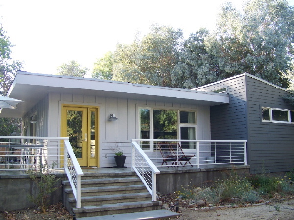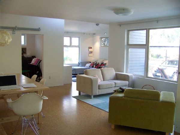
A panoramic view of the Sage home interior.

Sara and David's big goal for this house was to bring it in for $100 a square foot, no small task in the expensive Los Angeles county construction market. But they had a plan, to do copious research on their own, to get the most value out of every consultant they used, and every vendor and contractor they engaged, they resolved to build the house modular, to source their modules from a market with much lower labor cost in Utah, and to complete a good deal of the work themselves as sweat equity. It was their dream to have a modern house and I must say they succeeded on every count. From finding the best materials and vendors, to researching planting material and submitting their own landscape plan for permitting, Sara and David did it all and tracked it in detail in their blog on LiveModern.com. It was a tremendous inspiration and people cheered for them every step of the way. Its hard to know how many other people they inspired to dig their heels in and pursue their own dream of a modern house.

When the work was done, well, almost done, and the smoke had cleared I believe Sara calculated that their cost worked out to about 114$/sqft. This was pretty remarkable at a time when there were literally dozens of prefab house start-ups trying to get traction. The lament was how everything was costing much more than expected, and much more than hoped. In that milieu of dashed hopes Sara and David fought and struggled to make their house happen at a cost that was a pipe dream for the rest of the market.

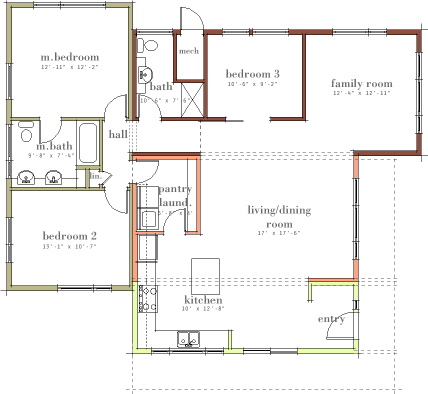
The house is a reasonable 1400 sqft, 3 bedrooms, with an open kitchen, living/dining, family room space, it really is a wonderful plan that lives much larger than it appears on paper. The modular units in different colors tell the prefab story. You should be able to orient yourself to the photos using the plan. The house site is unusual in that the back yard of the house is really at the side, so the front porch wraps around to the side, and that is the main back yard like space. The rear and other side have proximity to neighbors, more like a house typically has at the sides.
My favorite thing about the design is the three spaces you see in the photos - the kitchen, living/dining, and family room are each small square rooms that overlap at their corners, each space well defined, and very open to one another. It really walks the tightrope between open plan and discrete rooms. David and Sara brought a rough version of this floor plan to the table when they hired me, so they deserve the credit for its design, my role being more to refine, and adapt it to division into modules, and to resolve the plan into the 3d massing and window placement. It was truly a collaboration of the best kind. More photos in the browser below.
Technorati Tags: modern design, modern house, modular house, prefab house
Tidak ada komentar:
Posting Komentar