Senin, 31 Maret 2008

0751 Suburban House - first scheme

Today we'll look at one the schematic design ideas for this project site. This is the scheme described in the original posting as gathering the rooms around a high ceilinged living space. Today we will look at more views of the rough massing model, and a very rough floor plan of the house.


The image we saw in the first post.

click the link below to continue reading.

This scheme made an effort to "gather" the living spaces around the living room, making it a central hub of the house. Here is the ground floor plan:


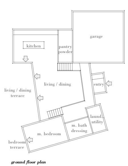
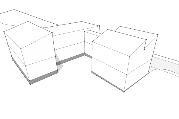
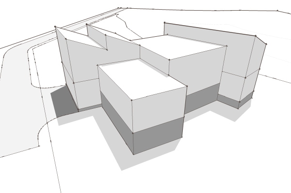
You note from the massing model that the bedroom wing which is opposite the driveway side of the house is a half level or so down from the living room level. The intention was to put the master bedroom on this lower level, increasing its apparent distance from the living spaces. The entry to the house from the ceremonial front was on this same half level below living, and the entry from the garage deposited you at the same place. So looking at the plan, the entry hall across the front of the house narrows where it turns towards the master bedroom, a door to the suite not shown on this plan. If heading up from the entry you come to a corner where the door from the garage would be, while you were offered views into the living space through a screen wall of some sort. The stair up to the living level brings you to the corner of the kitchen work space under a lower ceiling. The higher ceiling in the living space ends in a large windowed wall with a terrace beyond. The splayed geometry of the house is generated by the site, and has a nice effect of opening the house to the landscape. At the far end of the living room is the stair going up to the bedroom level.


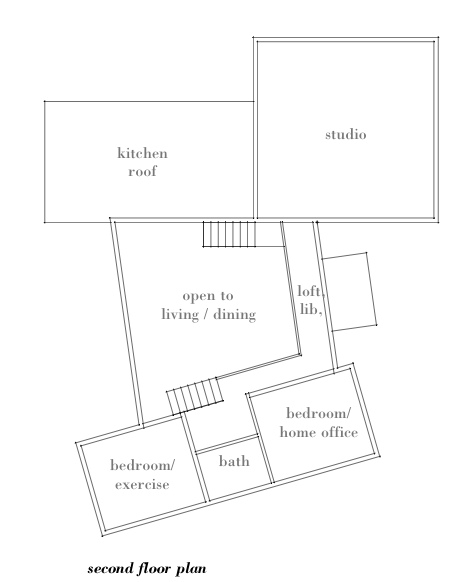
Now here on the second floor plan you can see how the secondary bedrooms overlook the living room. The idea would be that they could have sliding panels, or internal openings that made them like a loft overlooking the living space - remember the master bedroom below is a half level down, so these bedrooms are only a half level above the living room. A bridge like connection spans over the entry hall below bringing you to the studio space which sits above the garage. The circulation in this scheme is deliberately circuitous - it wraps around the living space like embracing arms. This was part of this effort to gather around the living space, expressed in another dimension, through the circulation and motion through the space.

Several other views follow.


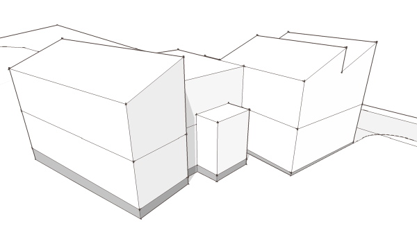
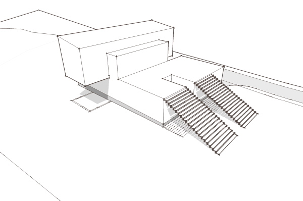
Fill that would be required is not shown in these masssing studies, so the floor level can be strangely off of what would be the final grade.


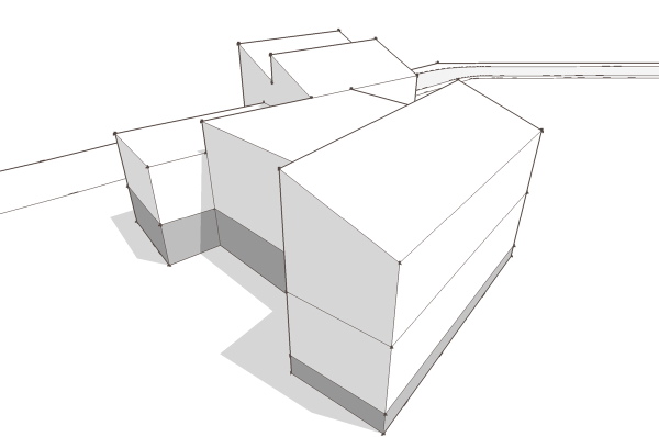
The rear terrace here would create an outdoor place at the level of the living room floor, which is not reflected in this rough mock-up.

So that was the first design idea. Ultimately it was abandoned for a number of reasons, but I still find the central living space and its relationship to the surrounding rooms compelling. The lower level master bedroom is also a great adaptation to a sloping site, but a site that slopes side to side rather than front to back.


Technorati Tags: ,

Love, Medicine and Better Hospital Design

During my most recent stay in the hospital – 8 1/2 years ago in Norwalk, to be exact – the best design feature of my room was a rainbow that my then-6-year-old-daughter made and which my wife taped to the wall. I learned a couple of weeks later, while reading Dr. Bernie Siegel’s Love, Medicine and Miracles, that the rainbow is a symbol of hope, and I still have two rainbows that Elie made me back then.

I also read in Siegel’s book (other than Walden, it's the only self-help book I've every read) that patients in hospital rooms with a view of the natural world have better medical outcomes than those who don’t. And so I was interested to read this article in the Atlantic about the importance of good-design in hospitals, and how hospitals tend to pay so little attention to it:

Consider diagnostic imaging departments. MRIs and CT scans can frighten many patients, and research shows that simple elements such as nature photos can ease their stress. Yet the typical scanner room still looks “as if it’s a workshop for cars,” says Malkin, with bare walls and big machines. One of the bleakest rooms at the UCLA Medical Plaza, where I spend my time, is a waiting room in the imaging center. Small and beige, it epitomizes aesthetic neglect, with stained chairs, mismatched tiles, and tattered copies of U.S. News & World Report. The only wall art is a drug-company poster on myocardial perfusion imaging—just the thing to comfort anxious patients.

The big exception, author Virginia Postrel points out, is maternity wards, where hospitals have been forced by competition to provide more home-like settings for families about to give birth. If patients in other wings and wards demanded it, hospitals would improve those places too.

I was pleased by the care at Norwalk Hospital. Nevertheless I hope not to go back. But if I do, I hope they’ve updated the place, with some thought to how to make the rooms more pleasant. They don’t have to be modern, just the result of modern-thinking.

Rabu, 26 Maret 2008

It's a Big Mid-Century Modern World

Mid-century modern houses are everywhere...

Savannah, Georgia, has historic houses dating back to the 18th century but it also has enough modern houses to make a modern house tour a worthwhile fundraiser for the American Diabetes Association. Here's an introduction to Savannah's moderns by a writer named Robin Wright Gunn, whose father was one of that city's modern architects.

There are lots of good flash pictures on this website, featuring modern houses for sale in the Philadelphia area.

And here are a bunch of photos of mid-century moderns in Chicago's north shore, which apparently has the same problem with tear-downs that New Canaan has. Denver too, here. -- ta

Senin, 24 Maret 2008

From the newspapers

In today's Newsday, AP writer Stephanie Reitz has the kind of story that we like to see appear fairly frequently to keep the Modern Architecture movement present in the public's awareness. Bite-sized stories like this which include some history and some current issues are so valuable to inform people who don't know of these wonderful expressions of our recent history, and to keep those who appreciate and hope to protect them up-to-date and inspired.

We'd like to mention to her, though, that the status of the Alice Ball house has changed, as we noted Friday in the post below.

And we (well, Tom in particular) would ask her to reconsider the broad assertion that, "While pragmatists may worry about what others see while looking in [the large windows typical of Moderns], a modernist architecture buff focuses solely on the view looking out. That means the landscape is precisely designed, often with a few focal points such as strategically placed birch trees or a fieldstone courtyard illuminated by lights tucked under the roof line's metal fascia." Most of the Moderns we've known and loved and even lived in are designed to exist respectfully and unobtrusively in their landscape. But I know what she's talking about - homeowners like Craig Bassam and Scott Fellows, who she refers to in her story, have been extraordinarily attentive to the landscape around their homes (here's another they own in in New Canaan), as it is an extension the precisely and beautifully restored structures. They understand one of the most moving and important things about a Modern house, as Reitz quotes Craig Bassam, "It's not like living in a regular house because you're really living within the landscape" – GF

Kamis, 20 Maret 2008

Letters from Sweden - wiring zen

Wiring is perhaps not one of the most exciting things to talk about if you are a house design junky. Getting power and lights to where you need them is unglamorous and underappreciated. But wiring is probably the biggest factor that determines whether a prefab house can arrive at the site finished on the inside, or empty - just a shell.


Why is that? The reason is that wiring is like the nervous system of your house. It runs in every wall, reaching out to switch locations, and lighting locations. It reaches every corner of the house without regard for whether or not those walls want to come out to the site in one piece or not. If a room can not come out to the site in one piece as it does in a modular house, then its likely it will come without the wiring. If walls come without wiring, then that means they are going to come without finishes because the wiring has to go in first.

click the link below to continue reading.


US style plastic junction boxes.

Here is the problem. In the US wiring connections must happen in a junction box, or j-box. Typically these connections are made in the boxes that lie behind switches and outlets or light fixtures. The reason is because anyplace you have a j-box you must have a cover to access that box - it can not be buried in a wall behind the wall board. And so it makes sense to make those connections at the devices which already come through to the surface, like switches and outlets. Ok - everybody is straight on that? Lets rewind to the prefab house factory. We want to build separate wall panels finished inside and outside like our friends in Sweden. But this means we have wiring in each wall section that must be connected when the walls go in place. But our connections have to happen at outlets boxes which are floating in the middle of the walls? What do we do? Introduce j-boxes with covers at the corner of each room? No. How about we leave a length of wire hanging out and fish the wire to the box? That would work in theory, but in practice it means having an electrician there when the wall panels are set, and leaving the wall panels dangling from the crane while the electrical work happens, and pulling that last bit of wire through in sync with the panel landing so the slack is not in the way. Forget it.

The real problem is not the boxes, its the wire. There are two components to a wire - the conductors, and the shielding for the conductors which prevents them from being damaged by nails and picture hangers. In the US commercial construction the shielding is usually metal conduit, either flexible or rigid. The conduit is typically laid and later the conductors are pulled through it. Connections can be made between conduit anywhere with proper fittings, and the conduit terminates at a box. Great - so we can join the conduit where the panels meet and pull the wires later, right? Not quite. The metal conduits are much more expensive and not used in residential construction. What you find in houses here is plastic shielded wire which is great stuff and inexpensive, but it bonds together the conductors and the shielding which means the two functions must go in at the same time and never a break between boxes.


Top: US style plastic shielded cable, bottom: US steel flexible conduit.

So, what we need is a decent inexpensive conduit system for residential prefab construction. Just like the Swedes have. Yes, of course that is the punch line, and once again the sick joke is on the US prefab industry. Our wiring fouls our progress every step of the way. The Swedes have redesigned their electrical components to make prefab easier. Lets look at their system briefly.

They use a flexible plastic conduit system, much lighter than our flexible metal, and equal or stronger than our plastic shielded wire. The ends snap onto the fittings on their plastic j-boxes making connections rapid and precise. They also have fittings that let you join lengths of conduit between boxes as you would where two prefabbed wall panels come together. I wish there was more to say but its that simple.


Swedish junction boxes and plastic flexible conduit.

After the house is set the conductors are pulled in the field using pull cords and fish wires. There is no way to avoid that field work until someday there are code approved connectors that do not require junction boxes. Such a product would allow panels to be plugged into one another when they are set speeding prefab construction.

There are also some useful accessories in the Swedish electrical parts that any builder would appreciate. In the US after the electrical rough-in is complete the drywallers come through and cover everything up. Somebody has to go around and find all the outlet and switch boxes again and cut them open. The Swedes have temporary covers that fit over their junction boxes. These covers have a magnet in them that makes finding them again easy. The magnet is centered, so this used to center a hole cutter that fits a power drill. It quickly cuts the wall board to just the right size. The temporary cover is removed to be reused again, and the box is ready for wire to be pulled. This really reduces a thankless job to an easy task.

Our correspondent from Sweden, Scott Hedges says:
... overall I think the point is that this is an affordable way to install the wiring paths for subsequent field assembly and in-field conductor installation. It reflects an innovation as significant as PEX tubing (that is the plastic tubing used for plumbing, Greg) in terms of speed of installation, and flexibility of assembly.


A Swedish junction box installed. You can see the plastic conduit very clearly here.

So that is the story of wiring and prefab in Sweden. We'll look at plumbing next. And we are getting closer to the end - thanks for following this story and all your comments. And all our thanks to Scott Hedges for the info and images of Swedish construction.

Previously:
Letters from Sweden - a windows tale
Letters from Sweden - panel building in Sweden vs the USA
Letters from Sweden - Europe is different, Sweden is not, sort of..
Letters from Sweden - land of modern, land of prefab
Letters from Sweden - conversations with an expatriate builder


Technorati Tags: , ,

The Owner of the Alice Ball House and the Town of New Canaan Have Reached an Agreement on Preserving the House

The Alice Ball House in New Canaan, which for a while seemed on the verge of being demolished, will remain standing and may in fact be on the verge of being protected.

Cristina Ross, who owns the house (which Philip Johnson designed), called me the other day to say she has settled her dispute with the town's environmental commission. They approved her request to put a driveway through a wetland, which would allow the back of her property to be developed, and she agreed not to knock down the Alice Ball House, which sits on the front of the property, on Oenoke Ridge Road, and has become a modernist icon and a preservationists' cause since she applied for and received a demolition permit last year.

However the settlement still has to be approved by the court, and the neighbors to the rear, who are part of a lawsuit that involves the town and Ross, still have to be mollified.

Ross said that if things work out, she might be able to sell the lot to a developer, who would have to save the Alice Ball House while being allowed to build in the back. That's what the neighboring family, who lives on a back lot, does not want -- they'd prefer to see the Alice Ball House demolished and a McMansion built in its place rather than have a McMansion built close to them. The acronym for that attitude, of course, is NIMBY.

She also can sell to an aficionado of modern houses. She said she has had serious expressions of interest from a couple of buyers recently, who have returned a couple of times. I neglected to ask her if that means there are two separate possible buyers or if the possible buyers are a couple, but whatever.

For the time being, it's good news. The Alice Ball House won't be coming down anytime soon.

Rabu, 19 Maret 2008

0751 Suburban House - project background

In a departure from the usual blog topics here I'm going to be starting a series of posts about local project, a custom home, that I've designed for a client here in the Delaware Valley region. While this is not a stock plan or a prefab several of the design schemes that we abandoned during the design process may ultimately find a second life as a house design in our stock plan catalog. So, while we will eventually arrive at what was the final design, its going to be more about the journey and looking at the sketches of the house designs we left behind, and seeing if any of them generate some enthusiasm and longing! Lets begin with some background on the project so you can understand some of the influences, pressures, and limitations imposed on the design.


The site is a parcel of 3 acres in a low density suburban zone outside of a small college town. The proportion of the property is a narrow rectangle with the rear closing to a point. A good deal of the front end of the site is consumed by wetlands, and its wetland transition zone, which can not be disturbed. This moves the home site towards the center of the lot, a good distance from the road making for a fairly private setting. This influences issues about how the house presents itself upon approach. Does it want to have a prominent "front" door when it really does not have a street life, or should it focus on the inevitable vehicle arrival?

click the link below to continue reading.

Another strong site influence oddly enough is the septic system. The septic design called for it to be located on the highest spot on the site, gaining the most distance from the relatively high water table. That meant that the home site was actually pushed down slope from the septic site, but if to remain on gravity feed to the septic then the house had to be at higher elevation. This put the first floor level of the house a good distance above the natural grade. So where the natural inclination would be to meet the landscape casually we were at a height above it, as you might be in an urban townhouse, except it was not driven by a need for privacy, but rather from the technical demands of the site. We were facing a contradiction that we would have to attempt to resolve.

The house program consists of 3 bedrooms, 2.5 baths, in about 2400 sqft plus a home office/studio space and a two car garage. Ample area for what is a very common program of space. Tempering it was a desire for an open plan living, dining, kitchen and "gathering" of the two secondary bedrooms around the living space - encouraging their casual use for other functions for exercise and home office and the occasional guest. An interesting condition, yet it could not undermine the use of the rooms in a more conventional mode by a family with children.

We explored several different alternatives which I will briefly introduce here. In entries to follow we will look at each design more closely. Some of these were developed only very roughly, and some not even worth showing here won't make an appearance.


Gathering the rooms around a high ceilinged living space.


Creating an entry forecourt between the garage and house.


Living spaces on top of the remainder as plinth.


A mulit-level interior space within a simple geometric volume.


An inhabited wall defines the living space.


Technorati Tags: ,

Elegant glass box in the woods

On the one hand, it looks a little like an office building in the middle of the lush, hushed woods, but I'll bet that impression changes when you see it in real life. I love that you can see out – and in – in unbroken cross-sections, and the illusion that the solid parts are hovering.

The house is designed by TNA in Japan, and there are other visual treats on their web site. – GF (via the girl in the green dress, via busyboo)

Senin, 17 Maret 2008

Louis Kahn: Two Museums and the Esherick House

Two of our favorite museums are the Yale Art Gallery and the Yale Center for British Art, both on Chapel Street in New Haven and both designed by Louis Kahn. My opinion is that the Art Gallery has greater paintings (like this one) but the British Art museum has better exhibitions and is slightly more pleasant to be in.

I mention here only because one of the few houses the Kahn designed -- the Esherick House, in Chestnut Hill, Pennsylvania -- is being auctioned off soon. The auction house website is here (pictures seem to be few) but you can also find it at Great Buildings Online, here.

Jumat, 14 Maret 2008

Heart of the glass house – it's definitely not a heart of glass

An interesting but perhaps overlooked part of The Glass House is its kitchen. Most people want to know how one uses the bathroom in a transparent house, and after they get over that, what about dressing and even just sleeping so exposed? Here is a short, sort of sweet story about the recollections of Raymond Girard, (88 years old), who spent a lot of time in that kitchen: he built it.

The story in the New Canaan News-Review says, "Girard's return to the Glass House marked the first steps in creating an oral history program at the Glass House museum. Christy MacLear, the executive director of the Glass House, said the staff plans to install an audio booth in the visitor's center."

The Glass House web site describes the Oral History Project thus:
Artists from Robert Raushenberg to Frank Stella, architects and scholars from Vincent Scully and Robert A.M Stern, clients such as Gerald Hines, and close friends of Philip Johnson and David Whitney will be target of this Glass House project to capture and collect conversations, musings, and insight from people who frequented and contributed to the Glass House since it’s completion in 1949. – GF

Tell Us What You Really Think

A few weeks ago, when I wrote about the Alice Ball House, someone submitted an anonymous comment* calling my analysis pathetic, my assertions nonsense, my conclusions claptrap, my justifications lame, and my "side-stepping lesser evilist comments about how other people have gotten away with it" smarmy. Other than that, I think he really liked the post.

Happily, all our readers aren't so crabby. The people who run Blinkdecor (and who happen to be our neighbors, in Stamford) noticed us, for example, and said nice things about us on their blog, here. Thanks! Take a look at their site, if you're unfamiliar with it.

There aren't all that many blogs that link to us, yet. Here are some that do, fyi: 100K House, eyecandy, and Green Redux.

And here are some that don't but should: Hatch (they're written nice things about us but haven't added us to their links yet), Moco Loco, Best House Design, DWR Design Notes, Grassroots Modern, Inhabitat, Land+Living, Materialicious, Midcentury Architecture. I mean, who needs a blog that links to BoingBoing and Engadget? Everybody knows those sites. Expand your horizons!

* Since everybody knows our names, I consider it my prerogative to reject mean-spirited comments from people who won't tell me theirs. -- TA

Senin, 10 Maret 2008

Danda

Danda is an online magazine on contemporary architecture and design originating in Belgium. I have so far found out very little else about it (like who is doing all the great compiling), but this I do know: it's packed full of wonderful links. I'd never heard of it before today, yet I'm familiar with many of the architects and sites they link to. Set aside a block of time and poke through those links – what a great diversion! . . . Something I could use a little less of right now, but maybe chipping away, a few links at a time is the way to do it! – GF

(somewhat randomly, the photos above are of Laurent Savion's Chamoson house in Sion, Switzerland, which I found through Danda.)

Sabtu, 08 Maret 2008

Virgina Plat House - windows in

The windows have been delvered and installed at the Virginia Plat House. Closed in, if not completely weather tight, they are in the clear to begin HVAC, plumbing, and electrical work inside.


You might notice that the windows are green (as in color, not sustainability). Nothing remarkable, but these are Andersen 400 series windows. Since like the beginning of time these windows were available in only 3 colors - white, tan, dark brown. Bleah! Nothing wrong with those colors, but Andersen offered no options for using the windows to introduce some color into your house. Meanwhile other manufacturers have been expanding their color offerings. I don't know if Andersen is experiencing competitive pressure because of this, but they have started offering a dark green now as one of their standards. Its a great thing, especially if you want to use a different color for the operable windows as the house designs show in our illustrations.

There are three more photos of the house with the windows installed posted at the flickr set for this project. Also remember to look at the LamiDesign Flickr photo pool to see all the photos from customers documenting the house designs under construction.

Technorati Tags: , , ,

Kamis, 06 Maret 2008

Home again, home again in the Glass House

I've visited the Glass House a couple of times in my life, and passed by it since I was a child at school a half mile down the road, either on bike or in car, probably thousands of times. My most recent visit was in 2001, when it was included on the New Canaan Historical Society's Modern House Day Tour. It was a crystal-clear, deep blue-skied, but definitely chilly, day. It was October, and the trees on the facing ridge – High Ridge, in Stamford, CT – were just starting to turn color. In the G.H. itself, a small fire had been built in the fireplace which is a concave scoop from the only solid volume in the house - the cylindrical, dark brown brick bathroom enclosure. The fireplace was shallow and the fire was built of thin logs in teepee shape - converging at the top and fanned out at the bottom. The smell and the warmth of the fire and the way the house integrated with land and the brilliant day was such an inviting pull I didn't want to leave. . . But I did because we were allowed to walk all over the property, and go into the main house, the library and the brand-new visitor's center which Johnson designed and had built in anticipation of the property being turned over to the National Trust for Historic Preservation. The Library was completely enchanting, due to it's intimate size and situation, out in a field and reached by a path through the high grass. The conical volume on it's top with glass at the narrow top, funnels light right down onto the reading desk is also a bit like a thinking cap. . . really the perfect place for concentration, pastime and contemplation.

Well – OK. Thanks for putting up with my dreamy little digression . . . Here's what I intended posting about: In the house there is one painting. It is "Burial of Phocion," attributed to Nicolas Poussin (1599-1665), and it sits, because there are no walls to hang it on, on an easel in the middle of the living area. Here is a story from the New Canaan News Review that explains why a 17th C. classical painting was chosen and beloved by Johnson and his companion David Whitney, and how it lives so comfortably in the most iconic of Modernist houses. I can tell you first hand that although the easel is a little confusing and a bit of an obstacle to get used to, the painting is right at home. – GF

Friday morning note: Interesting story (and I don't say that just because you're my wife). There's a big and no-doubt mobbed Poussin show at the Met. The Times has a slide show of some of his paintings, if you're not familiar with his style, here.

On a related note, the Glass House has produced three short films giving people's impressions of the place. Most of it is very serious and solemn (the music is a giveaway that this is important stuff), and I watched it all and found only two things that were slightly funny (Frederick Noyes, Eliot's son, remembers visiting as an 8-year-old and wondering where you go to the bathroom, and someone else who I didn't recognize says that his impression of the Glass House was, "Nice wallpaper"). But they're worth looking at if you have an extra 20 minutes, here. -- TA

Selasa, 04 Maret 2008

Architects We've Never Heard Of

Living near New Canaan, we sometimes let ourselves be fooled into thinking that if a house wasn't designed by an architect we've heard of, then it's not worth noting. We have the Harvard Five all over New Canaan, Edward Durrell Stone in North Salem, Bedford Hills and New Canaan, Edward Larabee Barnes in Pound Ridge and Mount Kisco, so what else do we need?

It's a ridiculous tautology of course -- this architect isn't interesting because we haven't heard of him; we haven't heard of him because he isn't interesting -- but it's sometimes true.

Overnight there was a notice of a house now on the market, designed in the late 1950s by Taylor Gates -- an architect I've never heard of. It's an interesting house, at least from the photos, and it's owned by a woman Gina and I sort of have a connection to, so I Googled the architect and found this MidCentArc Flickr page, which has a fantastic array of photos from around the country, many more than I could click through this morning and many of houses designed by architects I've never heard of.


So what about Taylor Gates? Unfortunately there's not a lot about him on Google -- in fact virtually nothing except the listing for the house now on the market in New Canaan, which perhaps explains why I've never heard of him. The house, by the way, is 3,500 square feet, has five bedrooms, sits on three acres, and can be yours for about two million. But it's not bad looking at all, and if you photoshopped out some of the furniture shown in the real estate ad, it'd be even better.

Senin, 03 Maret 2008

J. Crew - Nothing New

Fun, interesting and gossipy: this post from Habitually Chic about the Kaufmann house in Palm Springs. – GF

Minggu, 02 Maret 2008

Modern Names for Modern Jobs

Some people's names are perfect for the jobs they do. Near where we live, for example, Jennifer Herring is the head of the Norwalk Maritime Aquarium.

Down in Galveston, an upcoming lecture series features a talk on April 19, called “Mid-Century Historic.” The newspaper there says it will focus on ...

...the architectural style known as Mid-Century Modern.

Buildings designed in this style are now turning 50 years old and thus qualify as “historic.” They are beginning to attract recognition and preservation efforts as much as houses from earlier eras.

Who will lead the discussion? An expert named Anna Mod. I wonder if she's 50 years old -- a mid-century Mod? -- TA

Sabtu, 01 Maret 2008

The Abandoned Breuer

Reading the NY Times story I wrote about (below) made me wonder anew about the fate of this 1969 building by Marcel Breuer. When you're driving up or down I-95 through New Haven, CT it's a real landmark. Although now, it's got competition from another, bright blue and yellow landmark right next door: the Ikea store which was built about 4 years ago. As a matter of fact, Ikea often uses the I-95-facing façade to hang humongous banners advertising their $1.99 breakfasts or $199 couches.

In 2002 there was a bit of an uproar when Ikea first showed interest in the adjoining lot
as described here by Kevin Mathews in "Design Community Architecture Discussion": The site is on land occupied by the 1969 Armstrong Building (recently known as the Pirelli building) designed by Marcel Breuer. IKEA's new prototype store is larger than previous stores (300,000 SF). The store's parking requirements have led to a proposal which removes the entire base to the rear of the of the Pirelli building and surrounds the Pirelli building with an asphalt parking lot and minimal planting. A good portion of the base of the building can be preserved with only an impact upon 80 parking spaces (out of 1.241 total). Likewise, the magnificent greenspace surrounding the building can be designed as "turf-parking" with inexpensive, accessible technology, similar to turf-parking technology used at the Westfarms Mall in Connecticut.
So, originally the building looked like this, at left, with greenspace! Hard to imagine as now it floats like a big bodiless head, bobbing on an ocean of asphalt and cars (no, "turf-parking" was not used!).

What will happen to it? – GF

Mid-Century Modern Corporate Campuses: their predicament mirrors those of MCM houses, but on a colossal scale

In tomorrow's New York Times Westchester (and the region) section, David W. Dunlap has written (and produced the very good photos for) an interesting story on the present states of use and disuse of some of the tristate area's immense and architecturally significant corporate headquarters. Shortly following WWII, open land in the suburbs – former farms and pastures and, in PepsiCo's case, a polo club – became corporate campuses, whose centerpieces of buildings were often designed by some of the luminaries of Modern architecture. Some of the big businesses have changed – downsized, merged – but others have hung on to and are thriving in their original locations. Two examples of the latter are PepsiCo in Purchase, NY, designed in 1965 by Edward Durrell Stone, and IBM's Yorktown Heights, NY research center designed by Eero Saarinen, which is so thoughtfully described and photographed by Mr. Dunlap.

The story opens with a profile of another, less fortunate Saarinen-designed corporate complex in New Jersey, this one for Bell Laboratories. Dunlap describes it thus: "The main building, with 1.675 million square feet of space, is organized into four pavilions set among atriums and linked by sky bridges. The perimeter circulation pattern leaves few offices with their own windows. Concrete walls divide many spaces." Interesting-sounding, but not nearly as elegant, warm and inviting as he describes IBM's research center - reading the last third of the article made me want to take up residence there! Read "The Office as Architectural Touchstone" here.– GF